Il Primo Maggio in Ritardo |
event
brand design
logo design
social
print
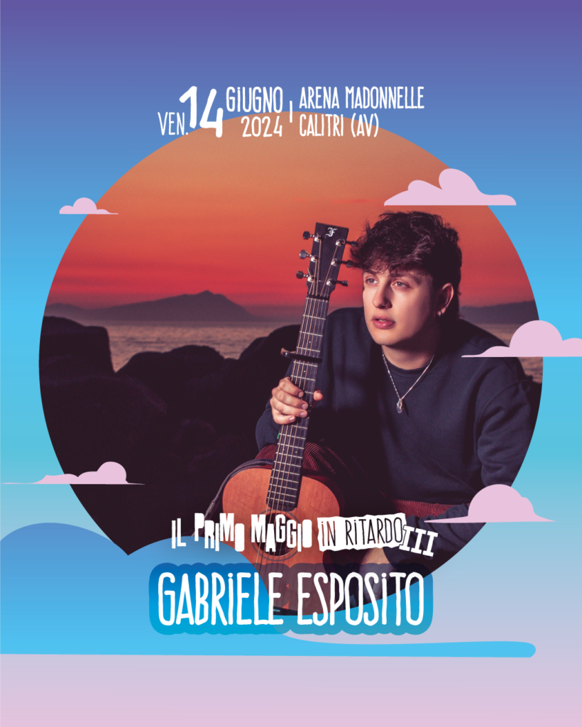
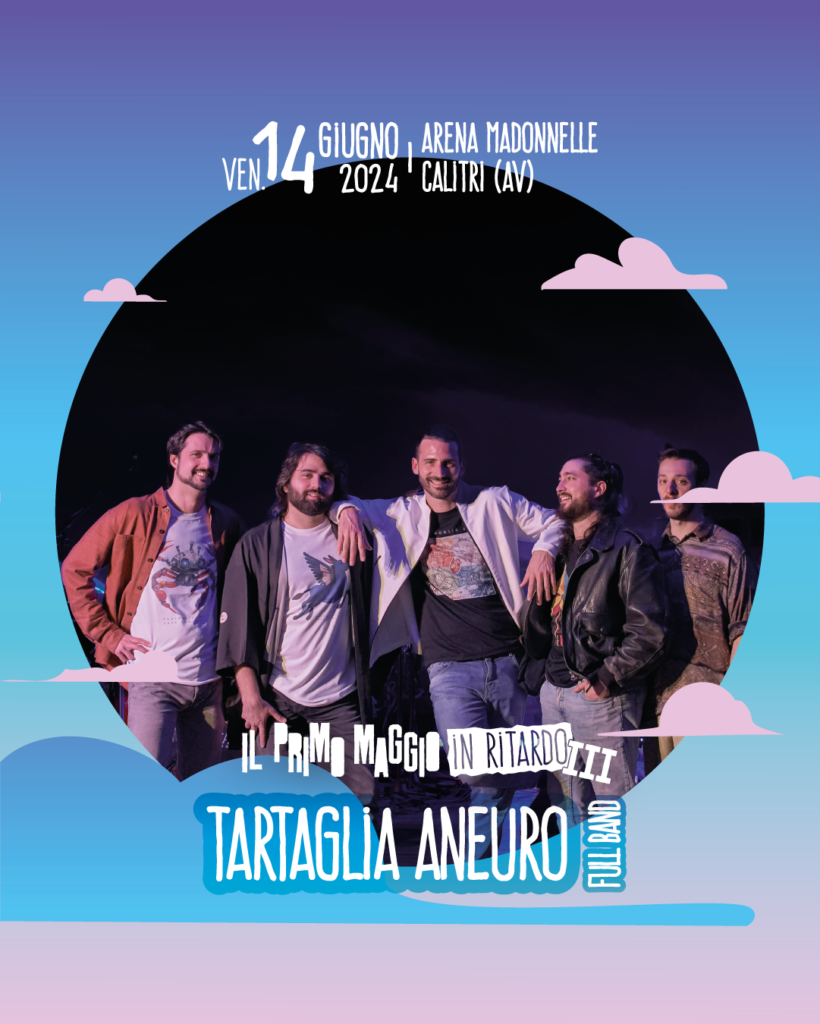
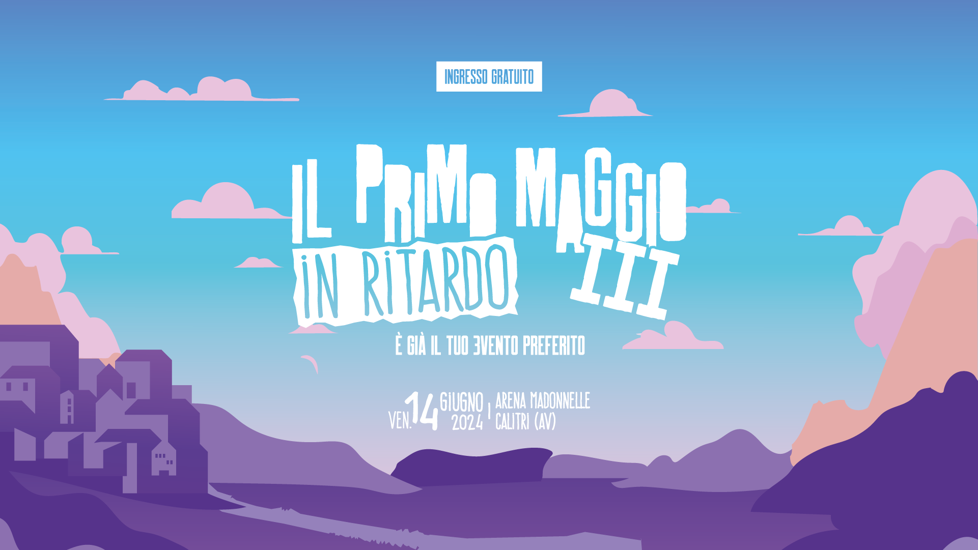
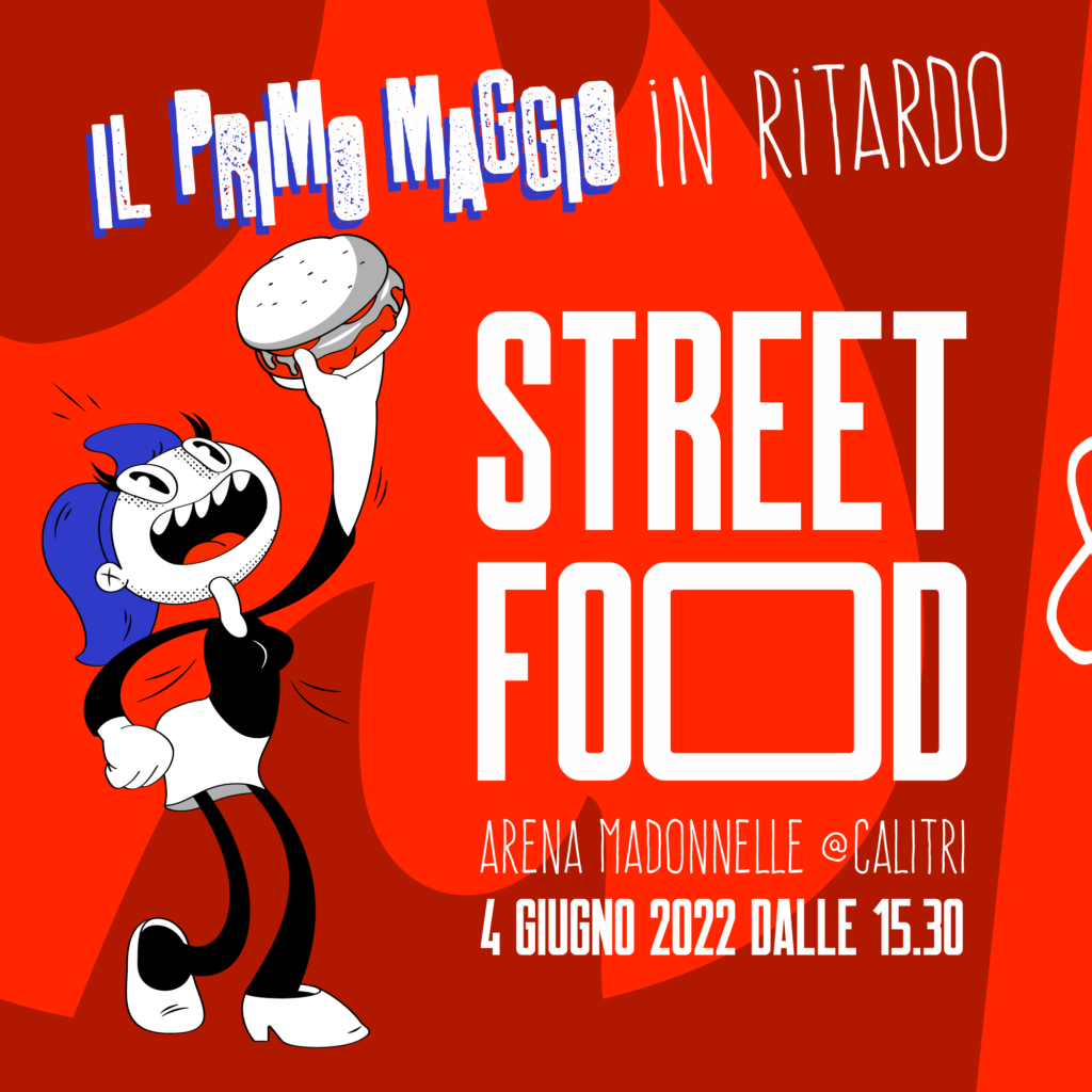
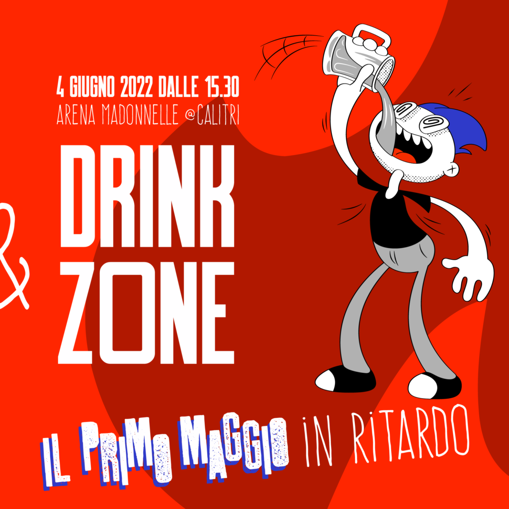
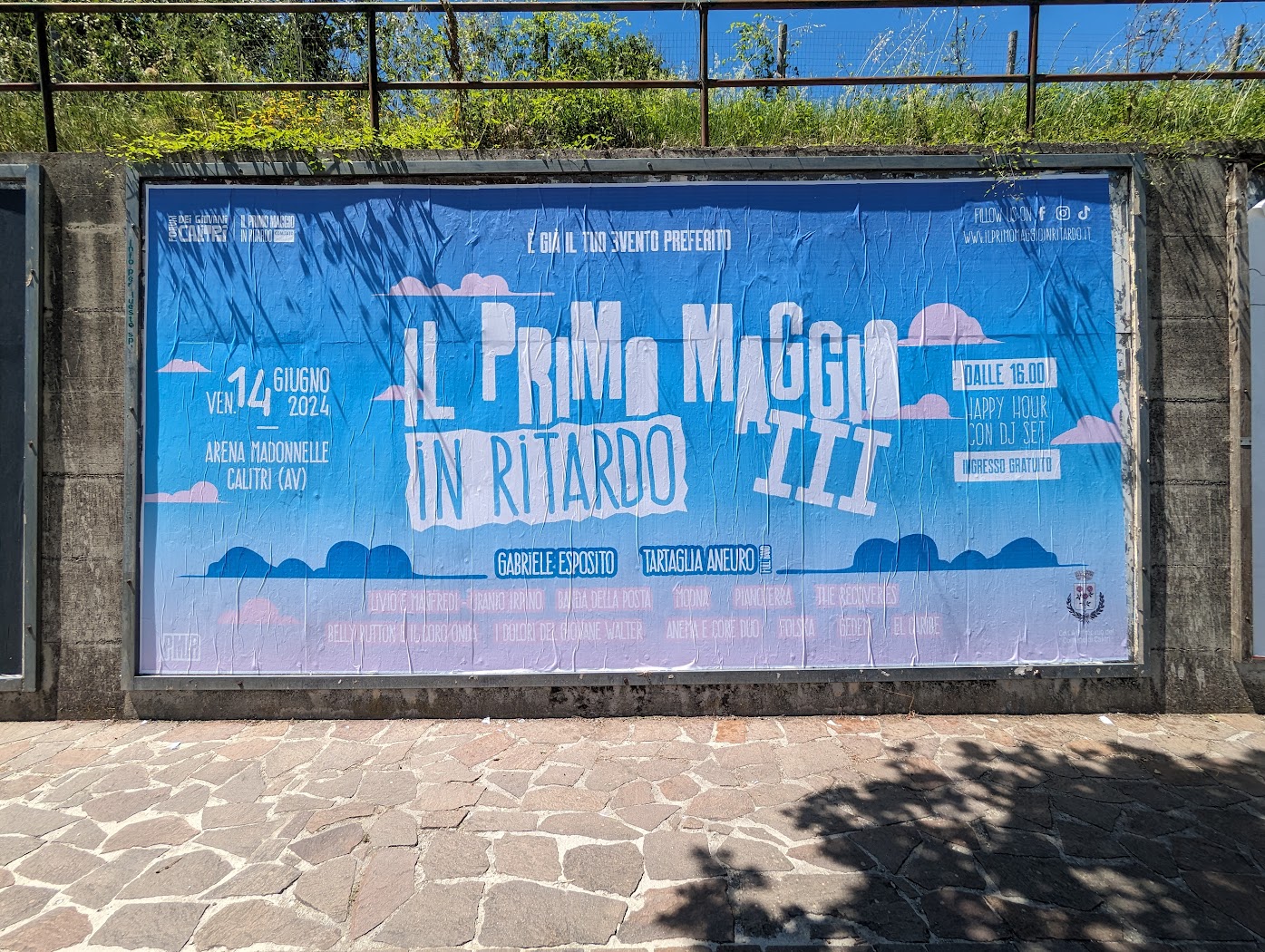
Il Primo Maggio in Ritardo is a concert that is inspired by the more famous May 1st concerts of Rome and Taranto, but takes place about a month later in Calitri, Alta Irpinia.
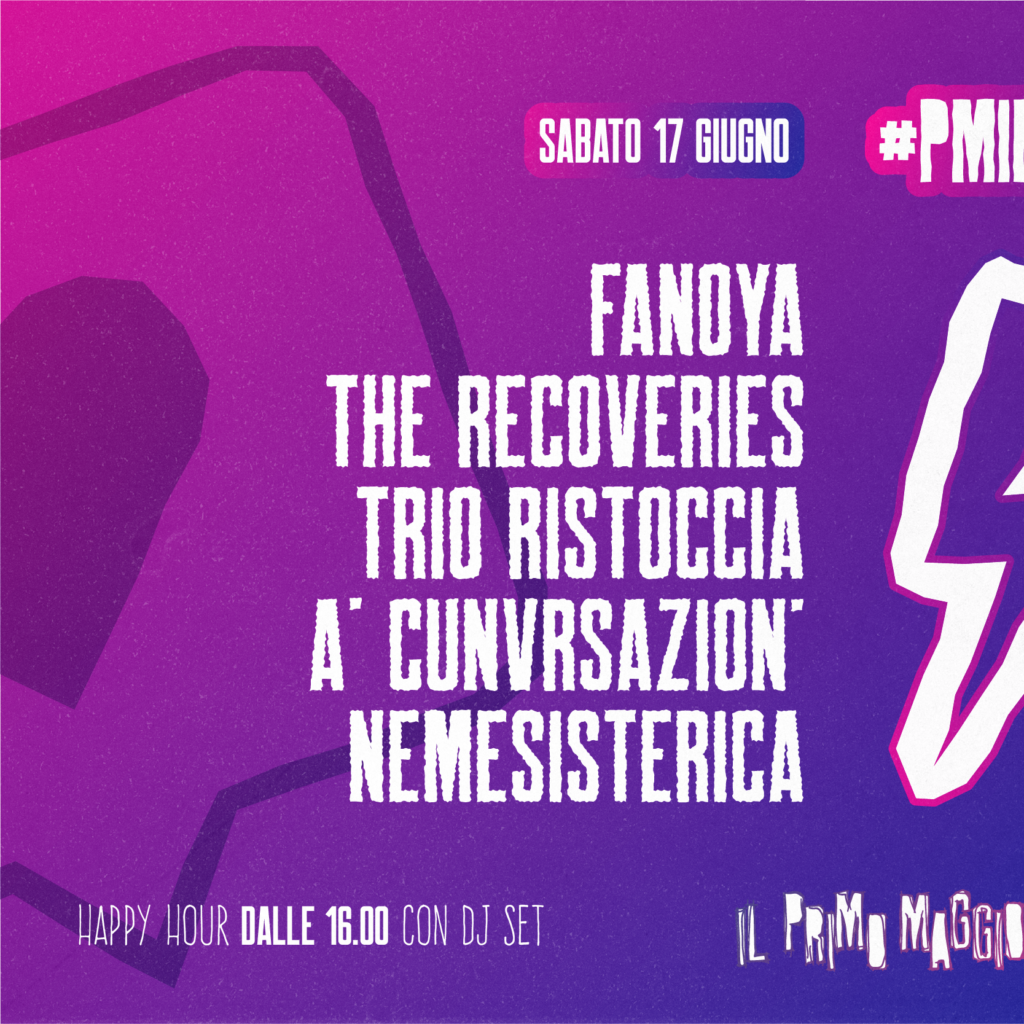
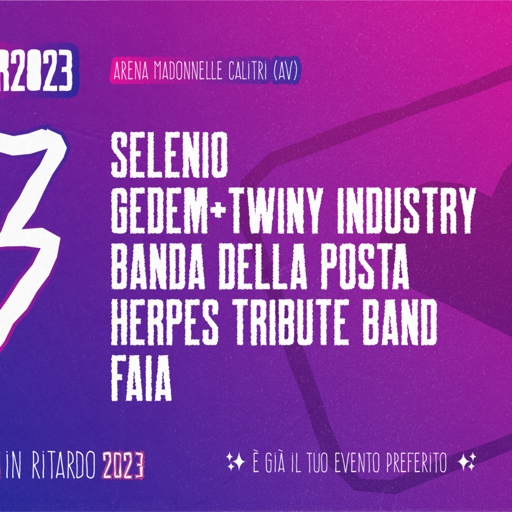
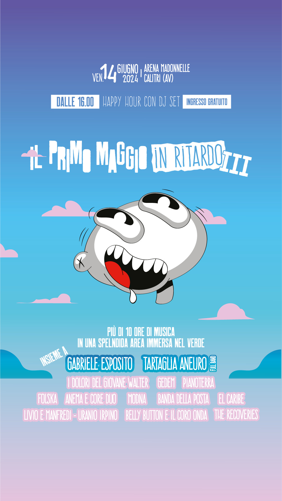
As the lead designer for the Il Primo Maggio in Ritardo (PMIR) festival, I was responsible for every visual and creative aspect of the event. My work spanned across multiple platforms and formats, including:
Social Media Management: Developed a cohesive visual identity and managed content creation to build the festival’s presence across platforms.
Print & Digital Design: Designed all event materials such as posters, banners, and event passes, ensuring a seamless look across both physical and digital spaces.
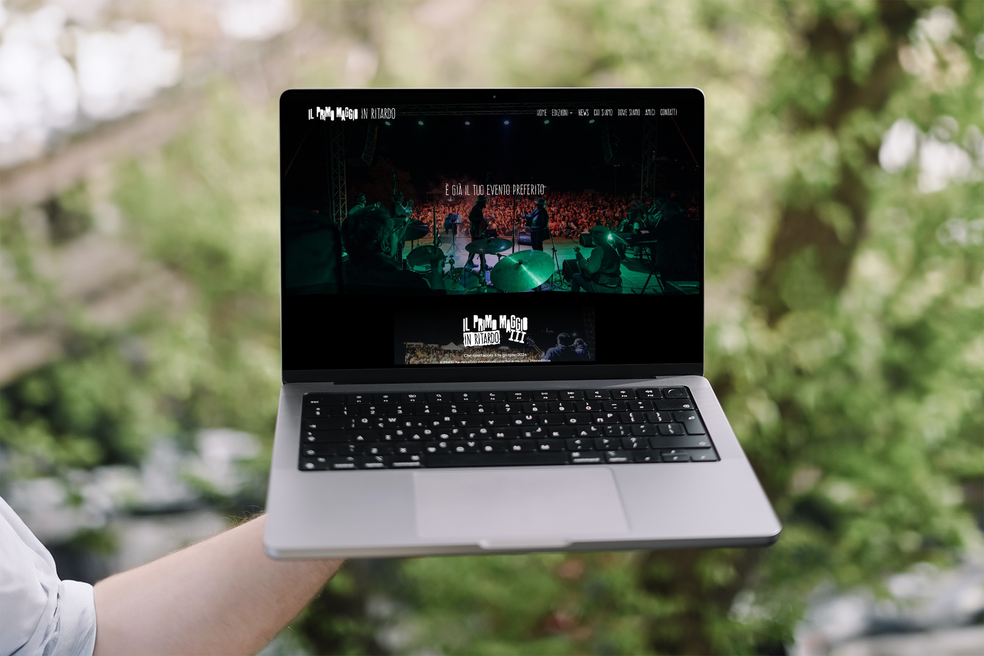
Website: Created an engaging and user-friendly website to inform and guide attendees through the event experience.
During the inaugural edition of Il Primo Maggio in Ritardo (PMIR) in 2022, I faced the challenge of preserving the festival’s brand identity while the organization launched a call for entries to attract artists for performances.
The key objective was to maintain the essence of the visual branding without revealing too much of the final design. To achieve this, I developed a sketched-out version of the visuals, offering a teaser of what was to come while ensuring that the brand’s full aesthetic remained intact. This approach allowed us to generate interest among artists and attendees without compromising the festival’s identity.
One of the most exciting aspects of curating Il Primo Maggio in Ritardo was collaborating with other brands to expand the festival’s reach and impact. A highlight of this collaboration was the creation of a special edition Aglianico Wine branded with the festival’s name. This not only celebrated the essence of the region but also strengthened PMIR’s connection with local culture and artisans.
To further engage both our online and offline communities, we produced custom PMIR stickers and distributed them across several Italian towns. These stickers helped bridge the gap between physical and digital interaction, encouraging people to engage with the festival’s message both in-person and online.
To grow the festival’s Instagram following, I produced a series of videos highlighting PMIR’s mission, our commitment to nature, and the reason behind the festival’s inception. These videos not only engaged our audience but also helped build a community around the event, fostering both awareness and sustainability efforts.
Additionally, I developed the festival’s website to expand our reach, communicate important updates to the press, and attract sponsors. The site served as a central hub for information, helping us secure attention and support.
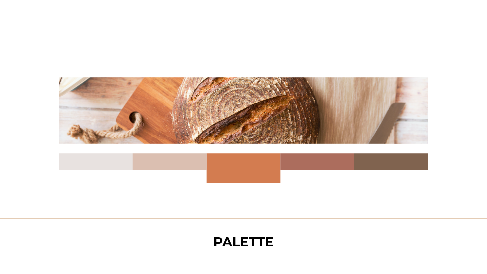
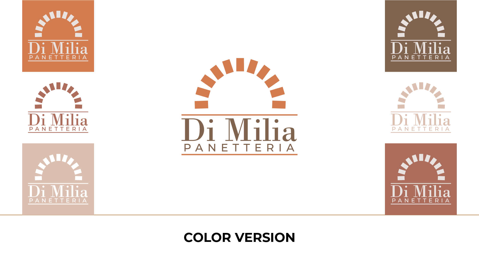
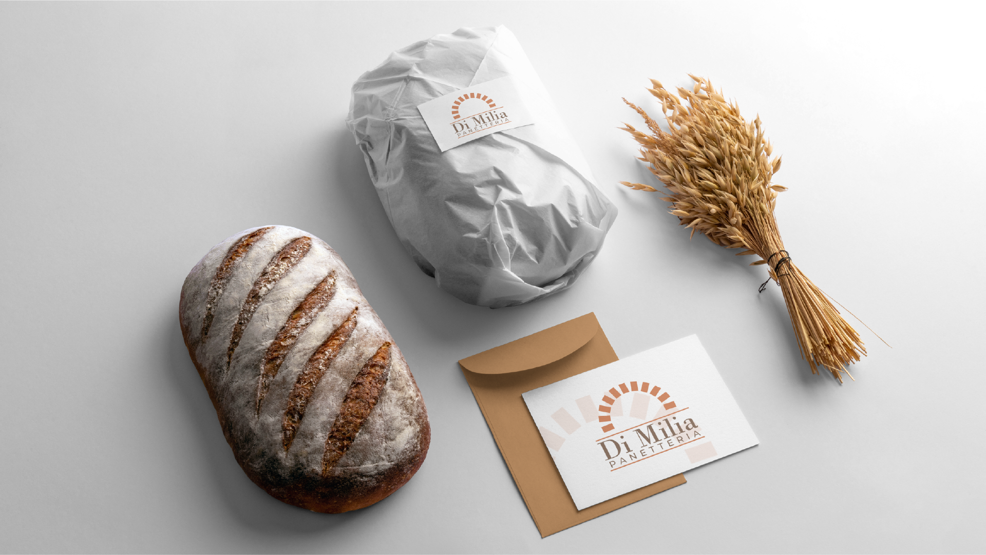
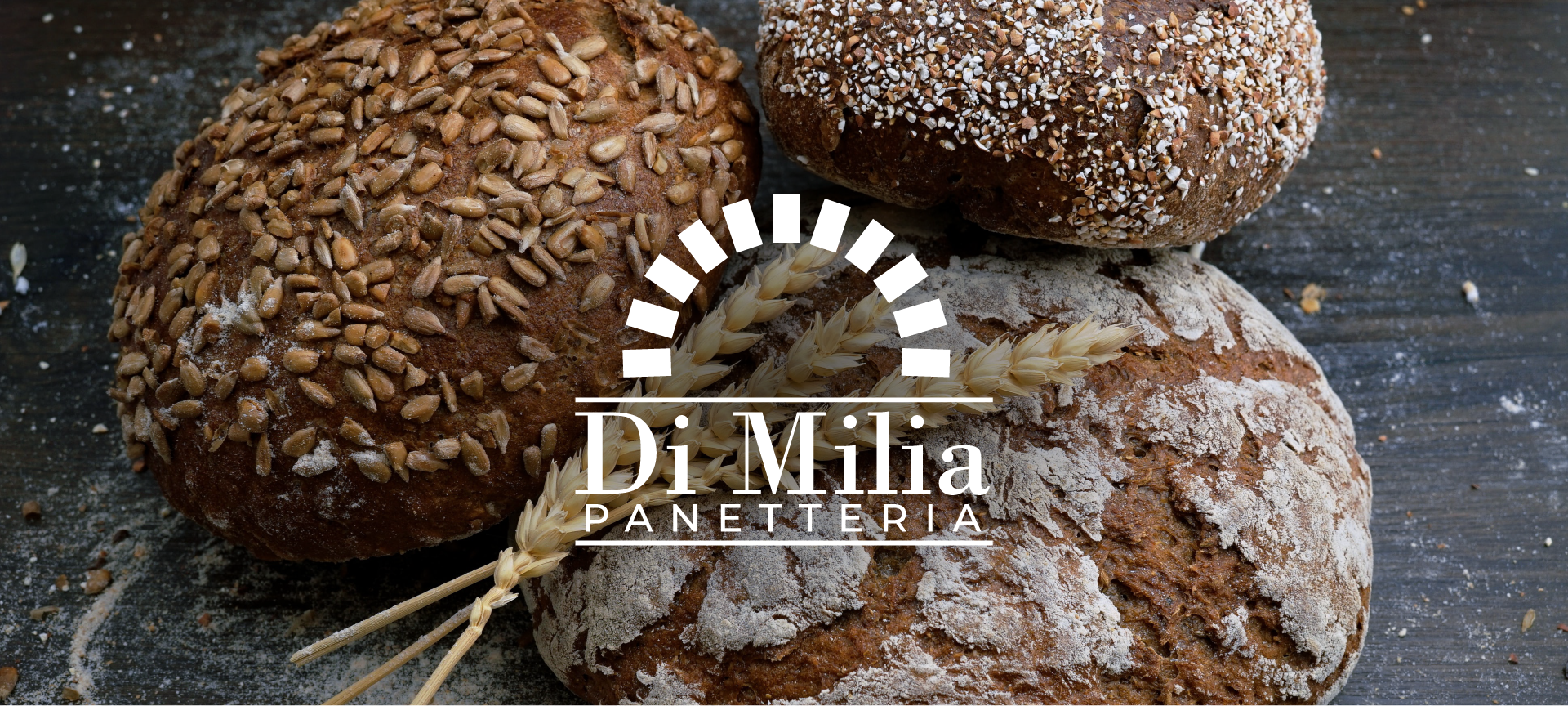
Crafting the Panetteria Di Milia Logo: Where Tradition Meets Elegance
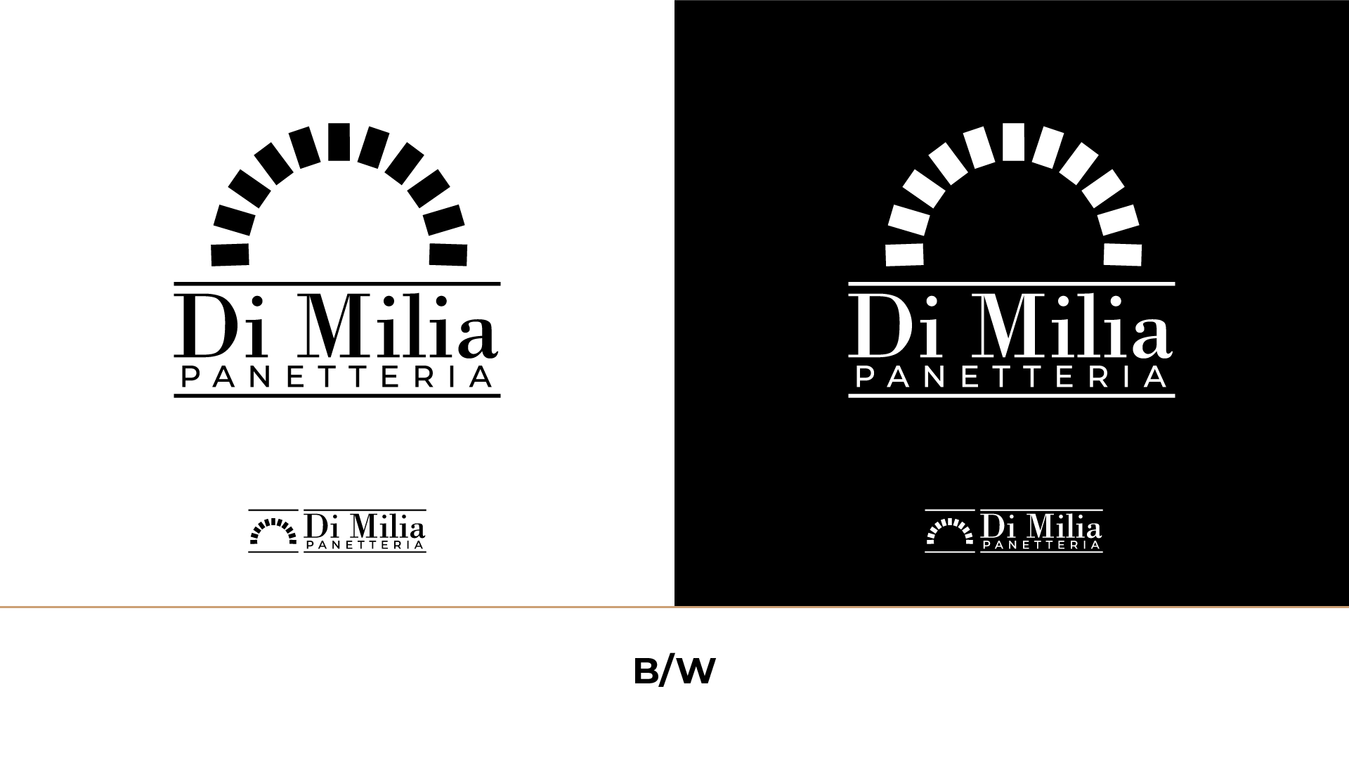
I had the distinct pleasure of designing the logo for Panetteria Di Milia, a haven of timeless tradition and elegant simplicity, where the art of breadmaking takes center stage.
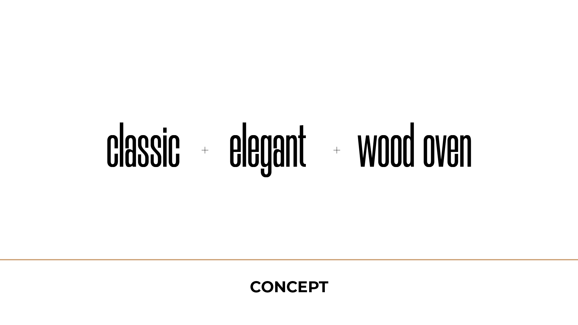
The concept behind this logo pays homage to the soul of Panetteria Di Milia—an artisanal wood oven, meticulously constructed from bricks. This iconic wood oven, symbolic of warmth and craftsmanship, captures the essence of the bakery. It’s more than a logo; it’s a testament to a centuries-old tradition of artisanal baking.
It’s a visual feast, conveying the passion and dedication that go into every loaf of bread.
As you behold the Panetteria Di Milia logo, you embark on a journey back in time, where simplicity and quality are the core ingredients. The logo speaks to the heart of the bakery’s ethos, where every bite of bread carries a legacy of flavor.
Anyone can design a logo. But not everyone can design the right logo.
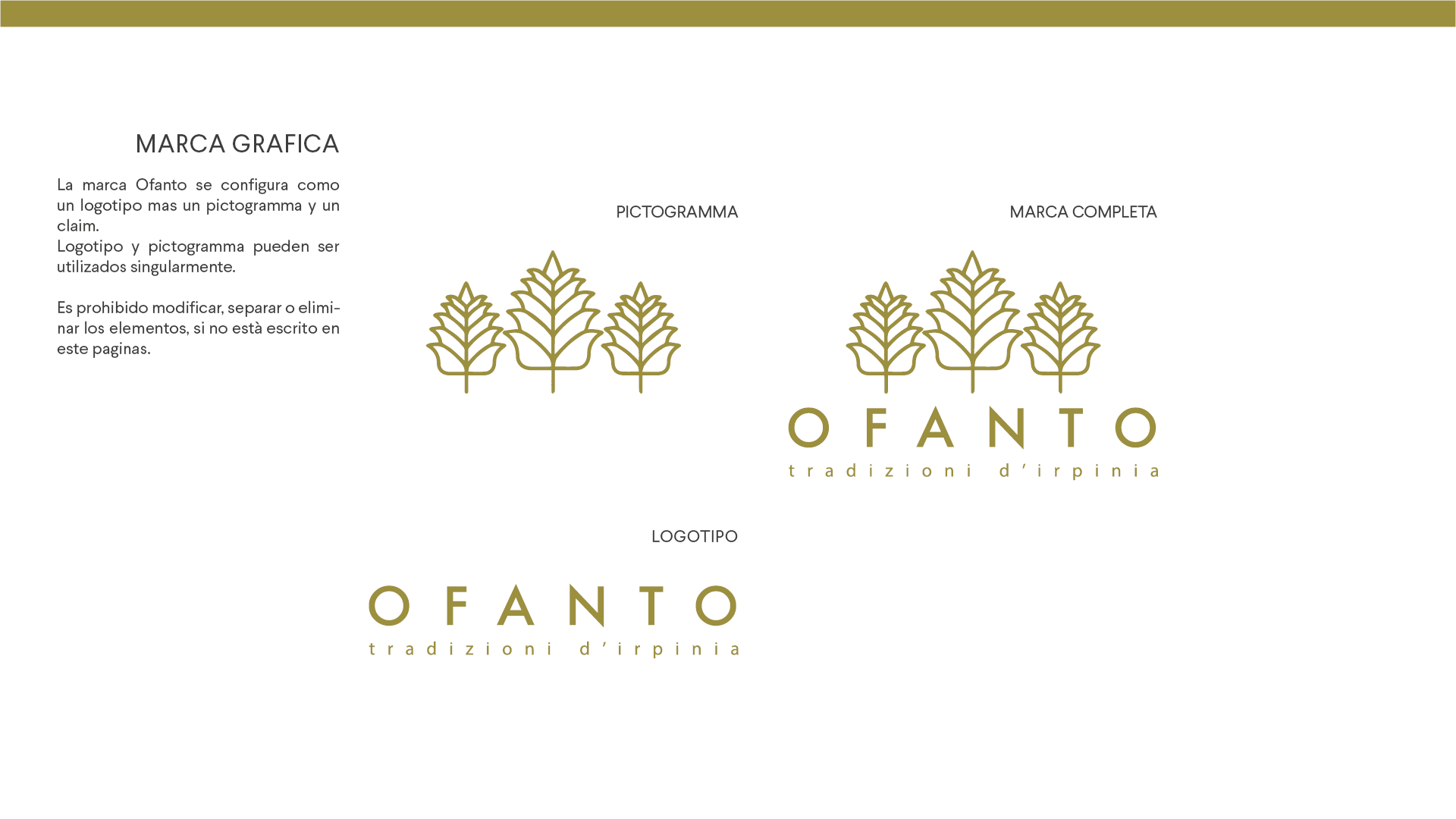
This brand was born in the south of Italy and its aim is, starting from the bottom, to make the products of this land known all over Italy and, hopefully, all over the world. In order to reach this goal, Ofanto’s products will be different from the competitors in the bakery market thanks to the traditional ingredients such as the “Senatore Cappelli” wheat, an old wheat that has nutritional properties that no other wheat in the world has.
Thanks to this quality and traditional recipes the products will be better than the competitors. This, combined with an aggressive national marketing can bring the company in the heart of the Italian consumers. The name, “Ofanto”, is the same as the name of a river, which is unknown to the masses but is the largest river in southern Italy. The ears of wheat indicate the type of product that the company produces and are three as a perfect number, like the perfection that Ofanto wants to reach.
Anyone can design a logo. But not everyone can design the right logo.
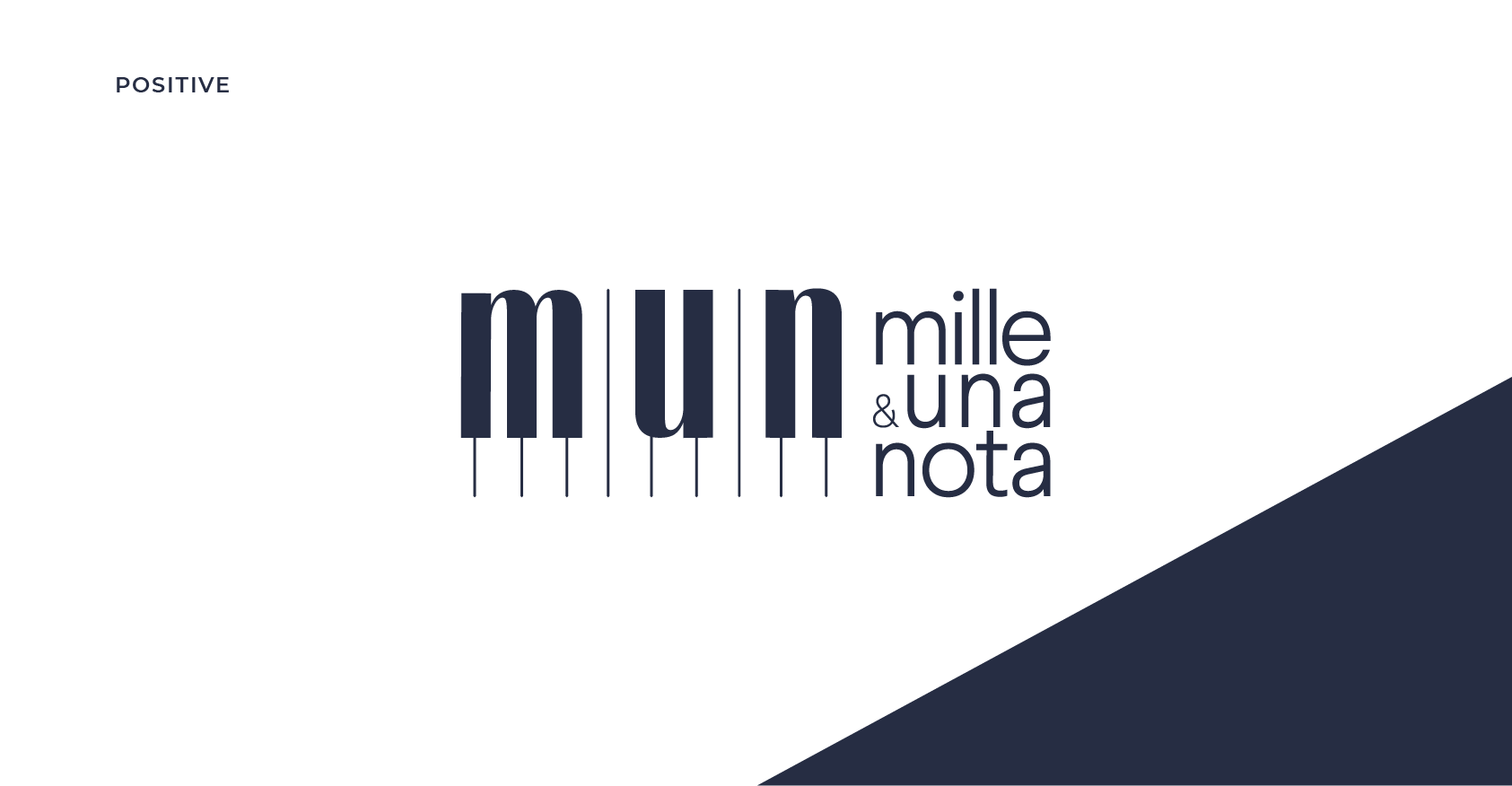
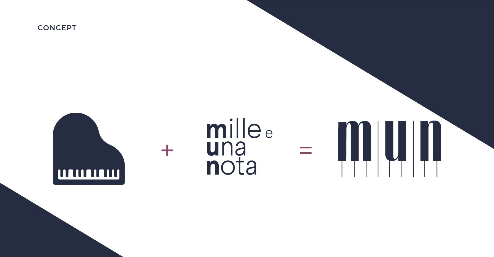
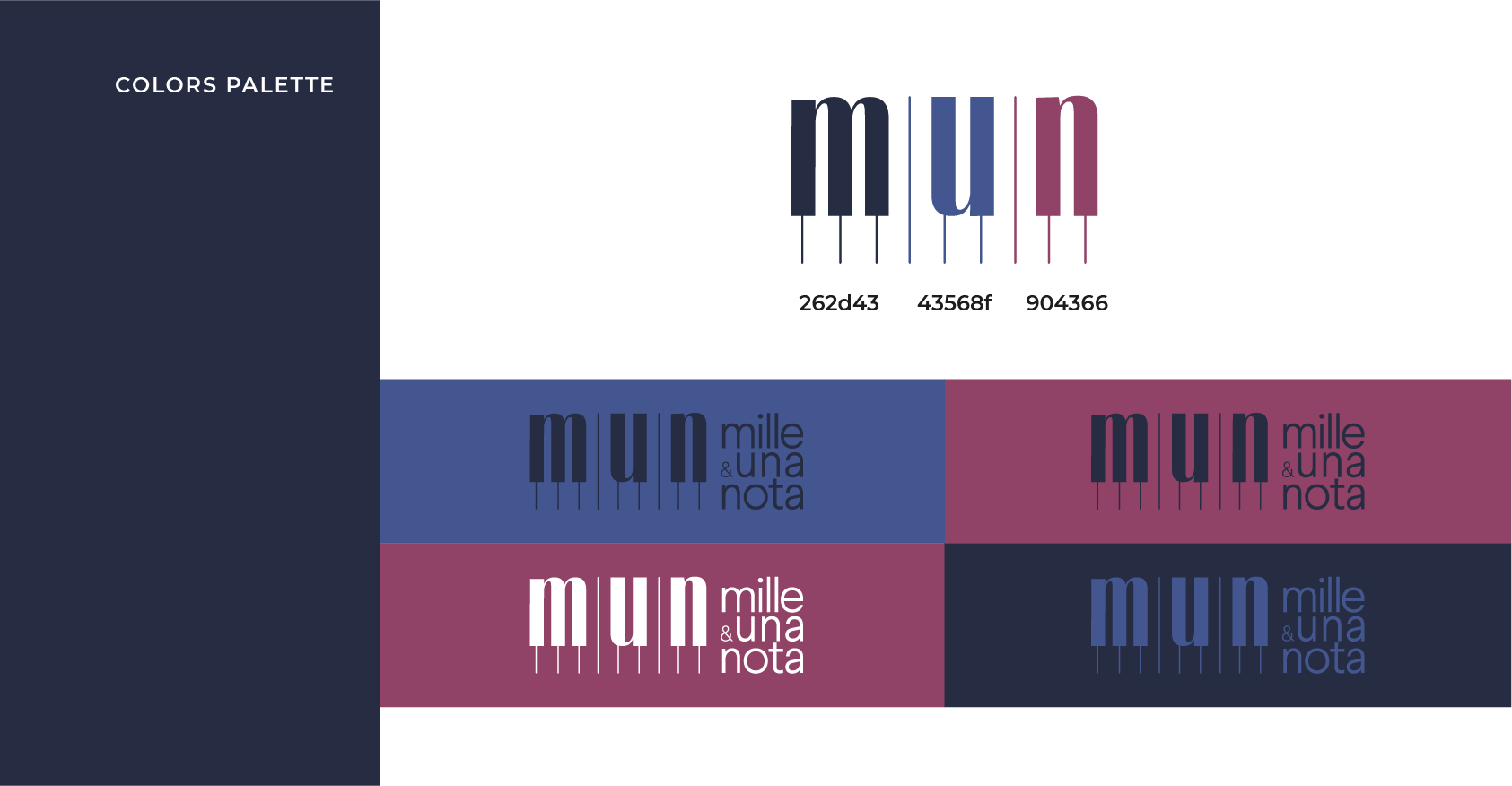
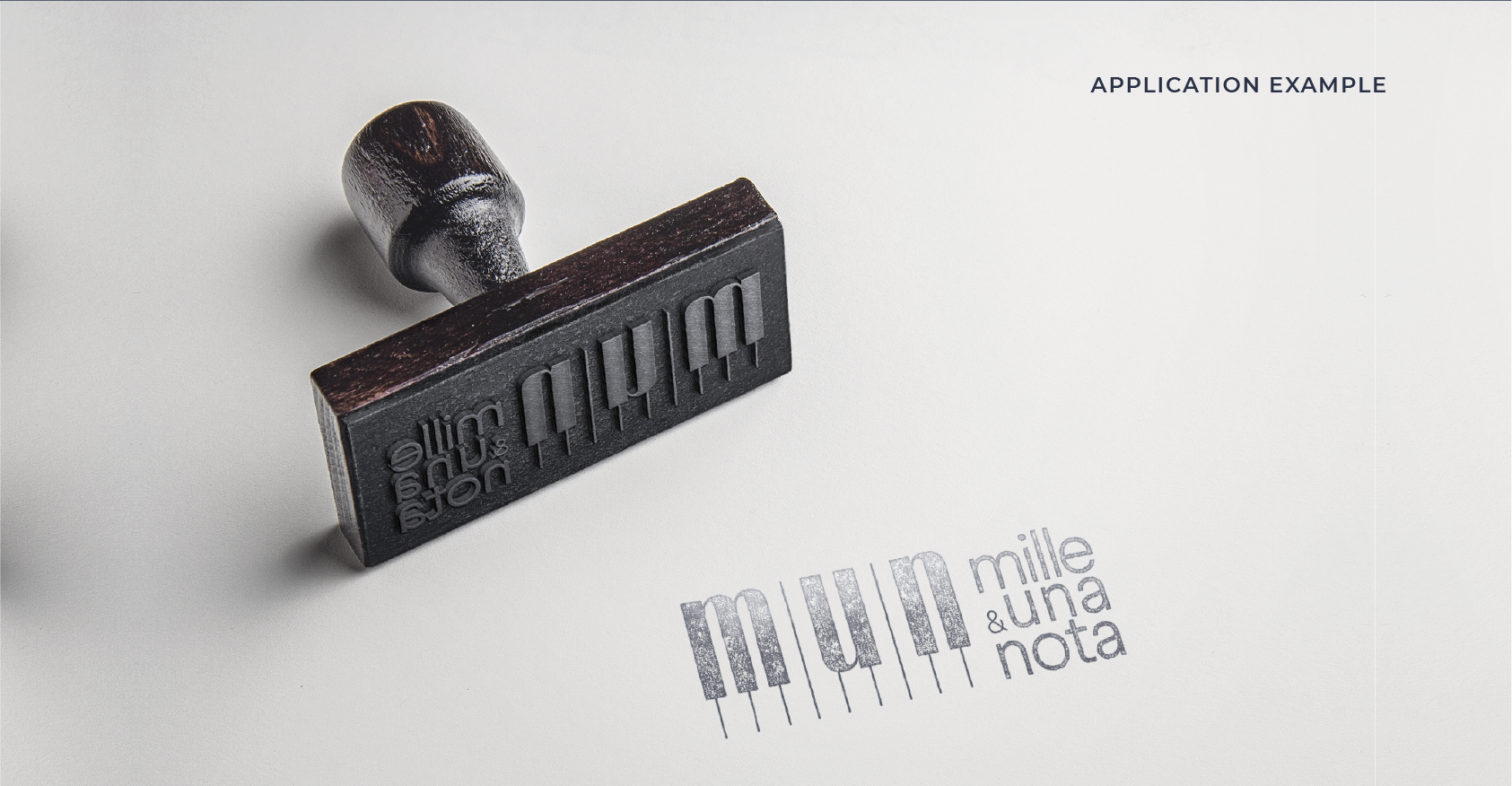
I had the pleasure of crafting a logo for Mille e una Nota, a musical association dedicated to helping people discover the joy of playing musical instruments. At the heart of our work is the “Concorso Internazionale di Musica Città di Airola,” an international music competition that draws talented musicians from across the globe.
The logo I designed is more than just an image; it’s a visual symphony. Inspired by the concept of the piano, a metaphor for the word “Nota” within the association’s name, I embarked on a journey to create a logo that captures the essence of music. This logo showcases a minimalist piano design, cleverly incorporating the first three initials of the association’s name.
Just as Mille e una Nota aims to inspire a world of musical passion, the logo serves as a harmonious introduction to the rich and diverse world of sound. It’s not just a logo; it’s a tune that resonates with the association’s mission.
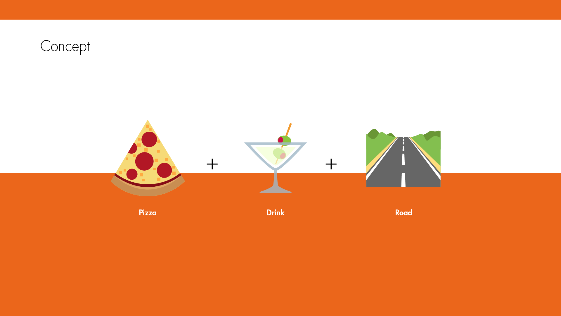
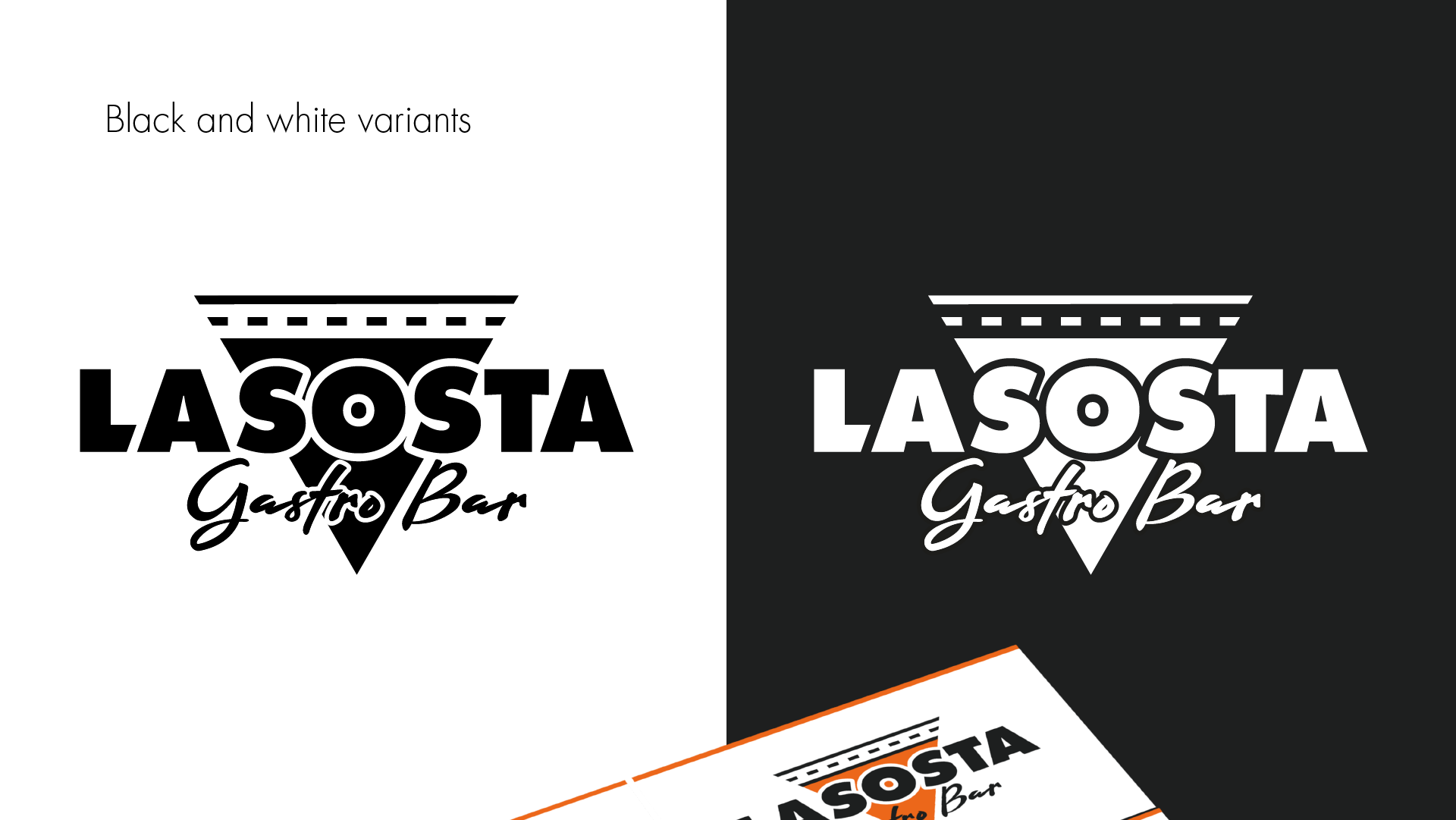
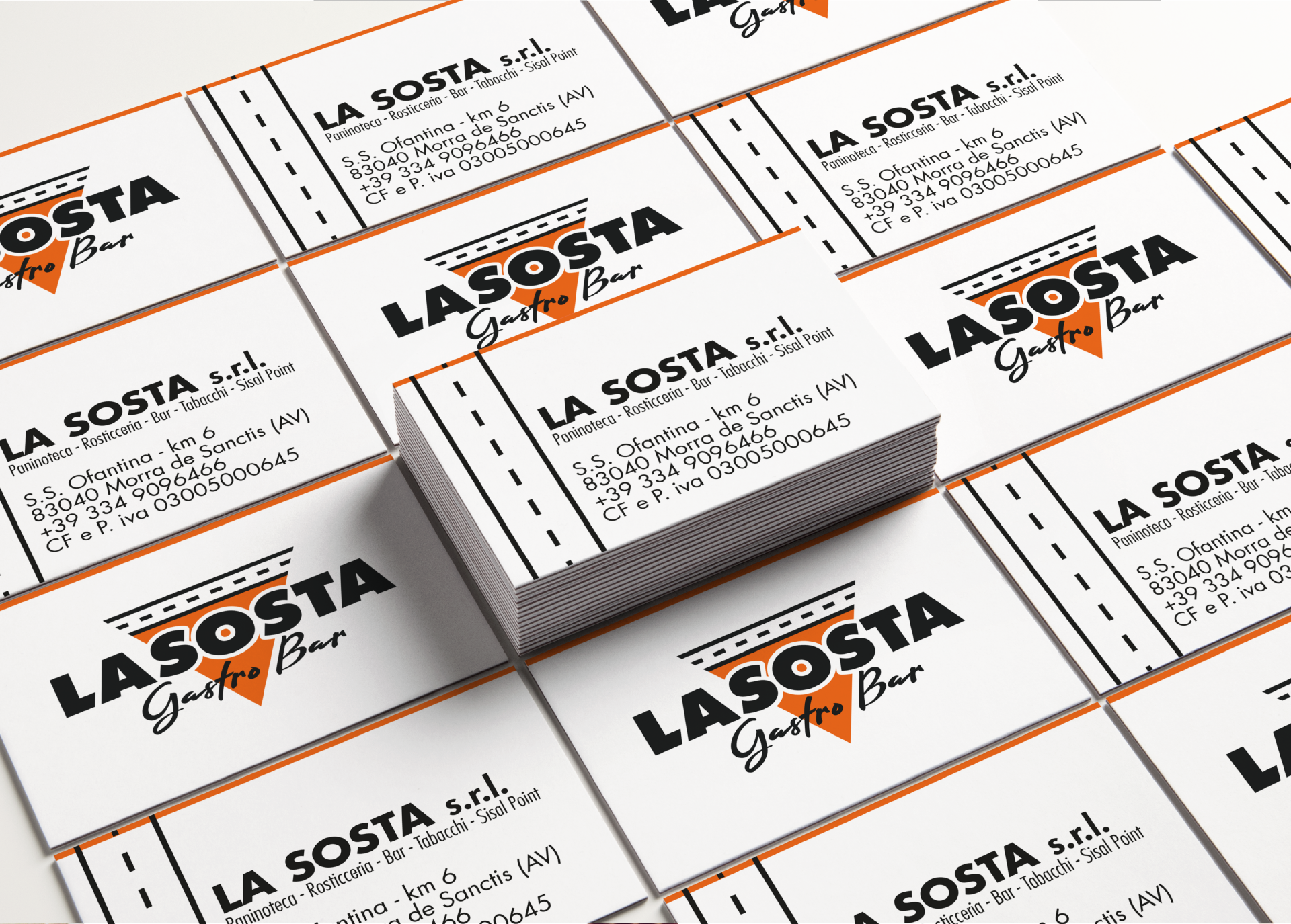
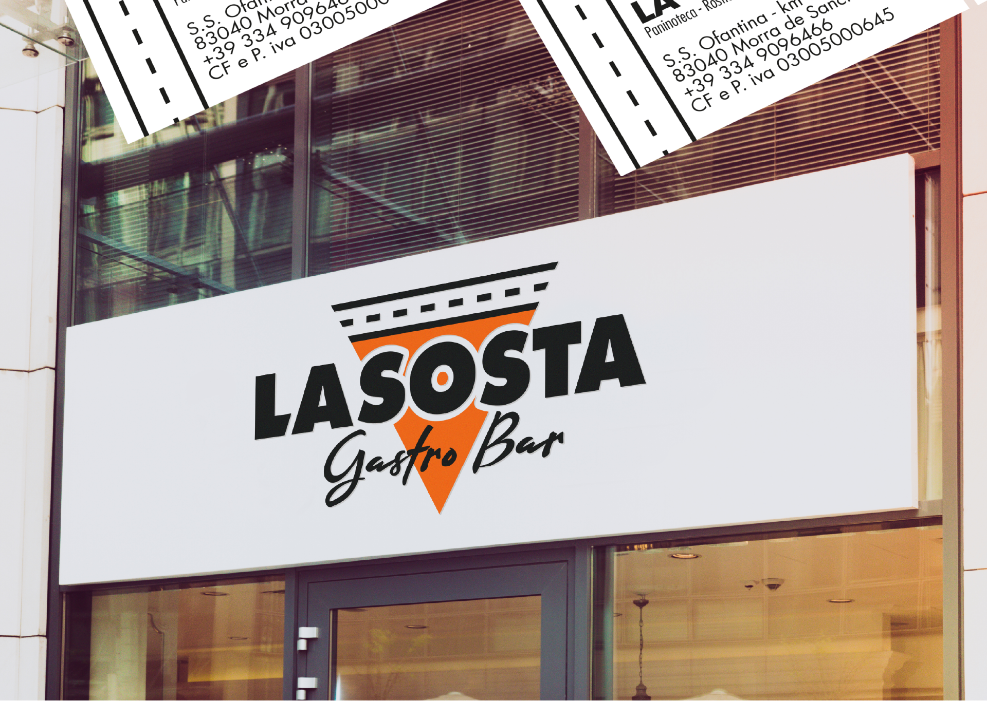
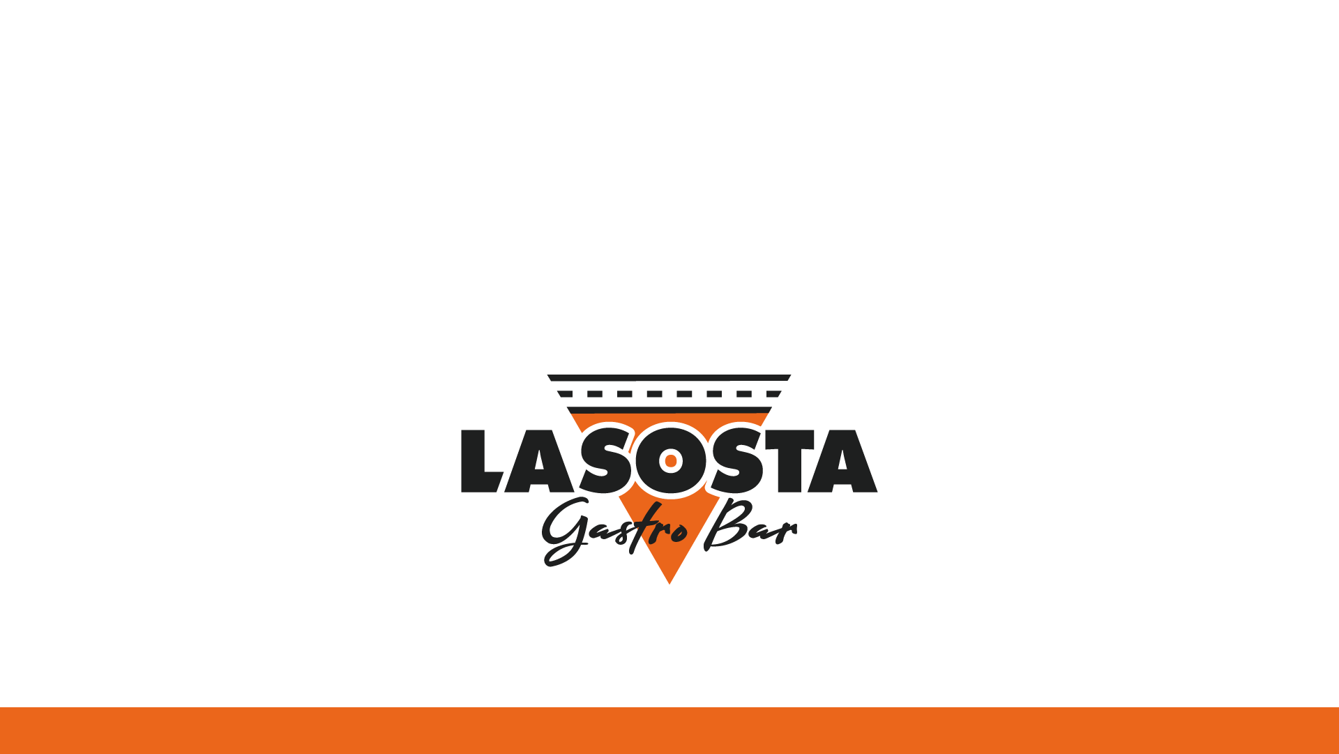
Allow me to introduce the logo designed for “La Sosta – Gastro Bar,” a hidden gem nestled along the picturesque “Ofantina” road, near the charming town of Morra de Sanctis. This emblem encapsulates the essence of this gastro bar, merging a sense of place with the promise of delectable food and drink.
At the core of the logo is the quest to convey not just the name but also the very spirit of “La Sosta.” The vibrant orange silhouette, crowned by a stylized road, effortlessly guides you to its doorstep, much like a welcoming beacon to travelers. It’s a visual ode to the convenience of the parking spot nestled near the establishment.
However, this logo goes beyond mere location; it tells a rich story of what “La Sosta” stands for. The iconic shape, resembling a triangular slice of pizza, embodies the fusion of culinary delights offered here. It’s a visual symphony that promises a delicious blend of flavors, where food and drink come together in perfect harmony.
As you gaze upon the La Sosta – Gastro Bar logo, you embark on a journey of discovery, where the essence of location meets the magic of gastronomy. It’s more than just an emblem; it’s an invitation to savor the distinctive tastes and flavors that await within.
Anyone can design a logo. But not everyone can design the right logo.
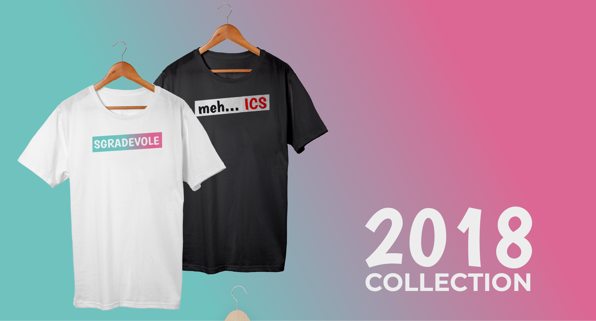
In July 2018, the “Sgradevole” project was born out of the whimsical camaraderie of four friends—Attilio Galgano, Enzo Merola, Michele Ricciardi, and myself. We embarked on a mission to turn our daily humorous phrases into unique, printed T-shirts. Little did we know, our quirky venture would take flight unexpectedly, with over 400 T-shirts sold in the scorching month of August.
Designed by yours truly and handcrafted by our team, these T-shirts not only brought laughter but also warmth to our hearts. With each sale, we decided to give back to the community, donating every penny to charitable causes.
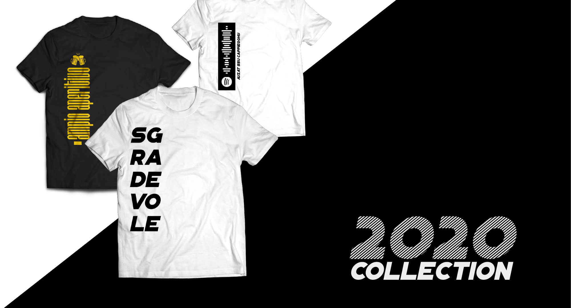
In the subsequent summers of 2019 and 2020, we expanded our horizons, launching new T-shirt collections that resonated with even more humor enthusiasts. Our customers embraced our offbeat humor, snapping up 585 and 707 T-shirts, respectively. These lighthearted moments transformed into something extraordinary, as we donated a grand total of €11,000 to various charitable endeavors.
Sgradevole Time Capsule conceived during the lockdown days of the COVID pandemic, it’s a time capsule designed to preserve the memories of those tragic days and deliver them into the hands of the future, 50 years from 2021. It’ll be opened in 2071. Hoping to be there 😂 www.sgradevole.net
We use cookies to ensure that we give you the best experience on our website. If you continue to use this site we will assume that you are happy with it.