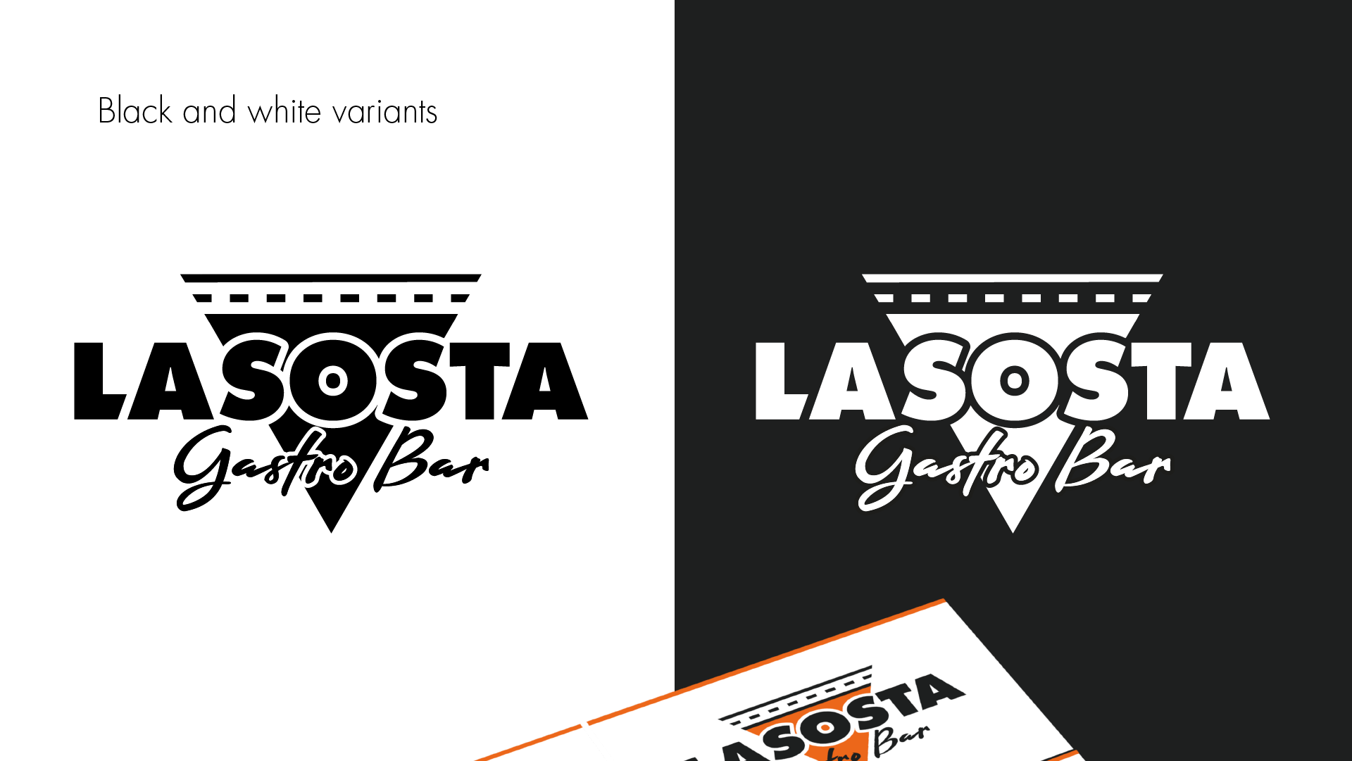
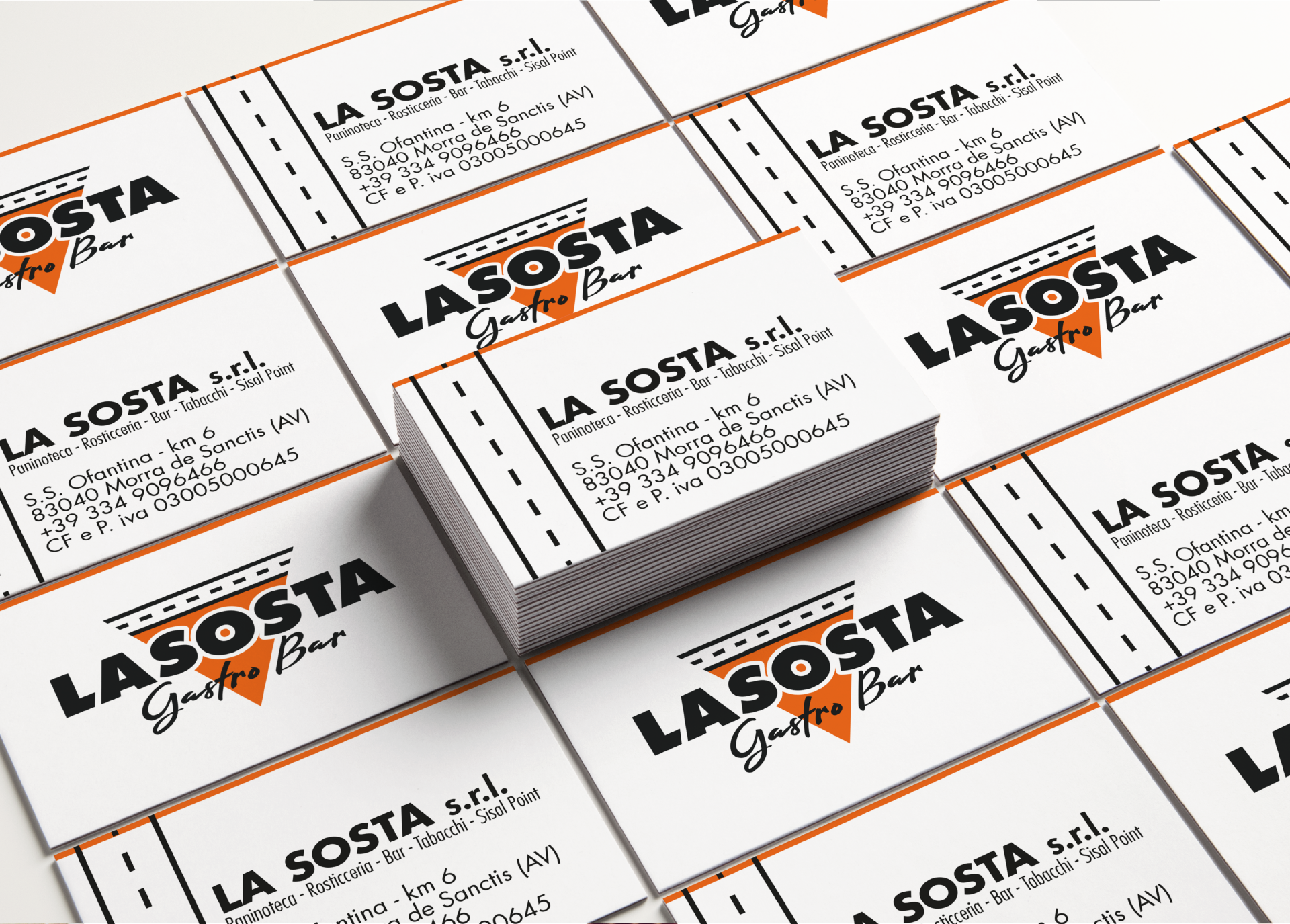
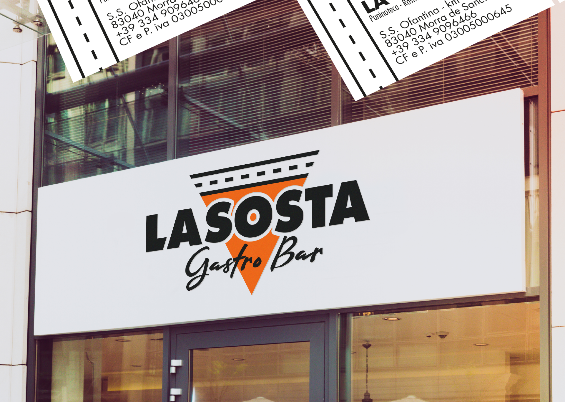
Allow me to introduce the logo designed for “La Sosta – Gastro Bar,” a hidden gem nestled along the picturesque “Ofantina” road, near the charming town of Morra de Sanctis. This emblem encapsulates the essence of this gastro bar, merging a sense of place with the promise of delectable food and drink.
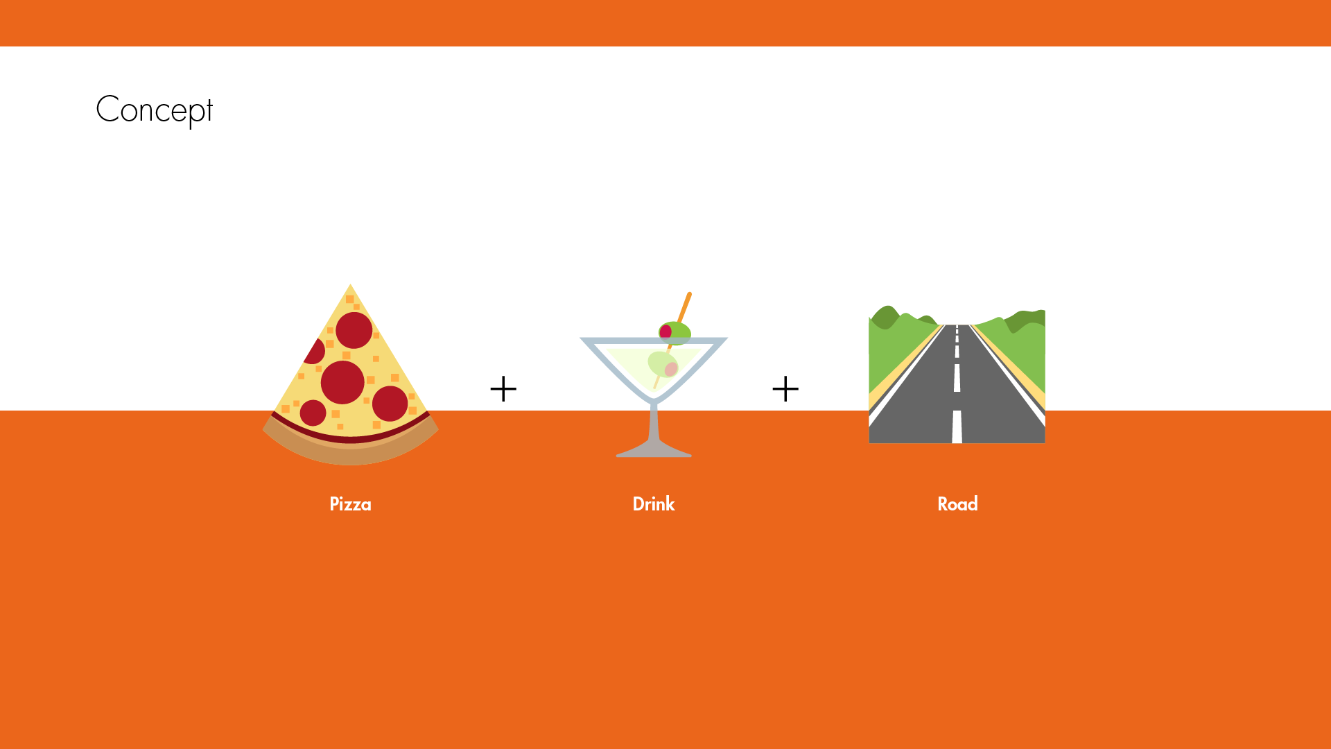
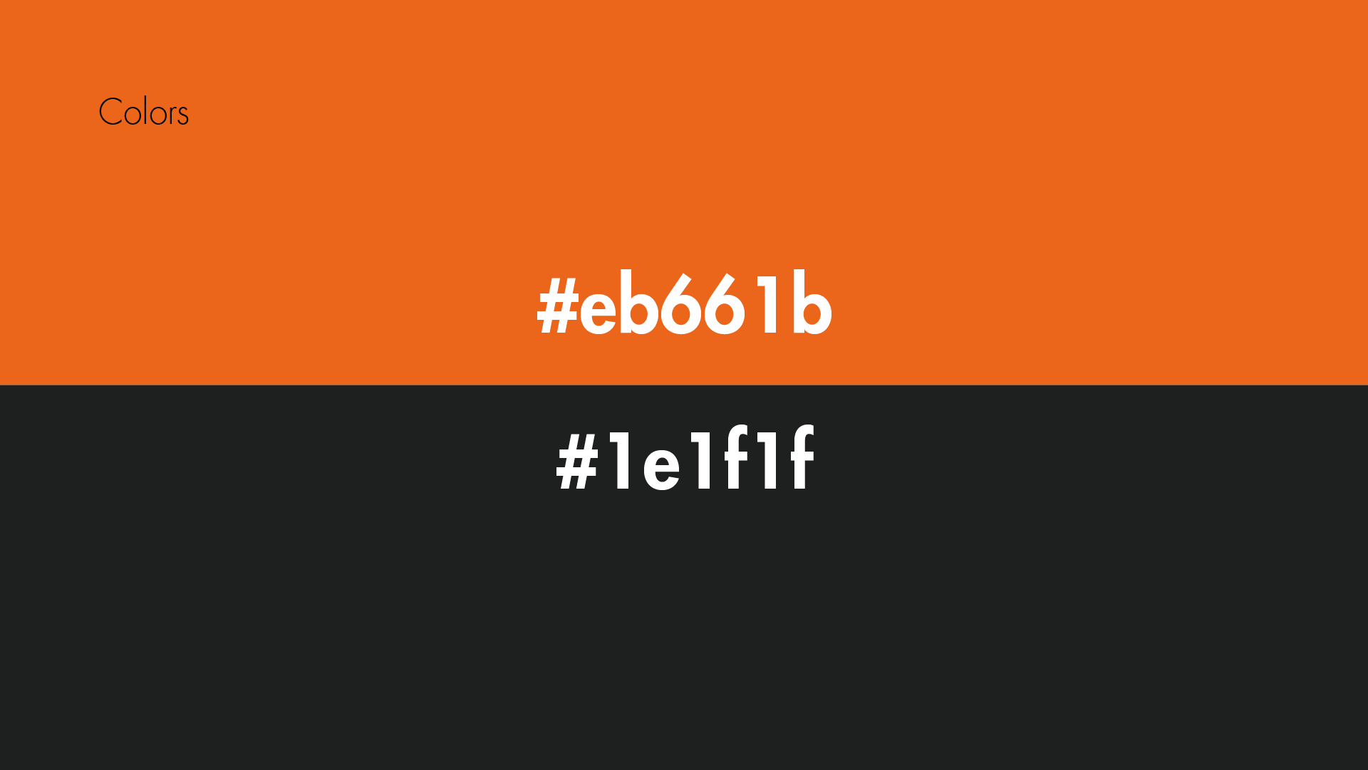
At the core of the logo is the quest to convey not just the name but also the very spirit of “La Sosta.” The vibrant orange silhouette, crowned by a stylized road, effortlessly guides you to its doorstep, much like a welcoming beacon to travelers. It’s a visual ode to the convenience of the parking spot nestled near the establishment.
However, this logo goes beyond mere location; it tells a rich story of what “La Sosta” stands for. The iconic shape, resembling a triangular slice of pizza, embodies the fusion of culinary delights offered here. It’s a visual symphony that promises a delicious blend of flavors, where food and drink come together in perfect harmony.
As you gaze upon the La Sosta – Gastro Bar logo, you embark on a journey of discovery, where the essence of location meets the magic of gastronomy. It’s more than just an emblem; it’s an invitation to savor the distinctive tastes and flavors that await within.
Anyone can design a logo. But not everyone can design the right logo.
We use cookies to ensure that we give you the best experience on our website. If you continue to use this site we will assume that you are happy with it.