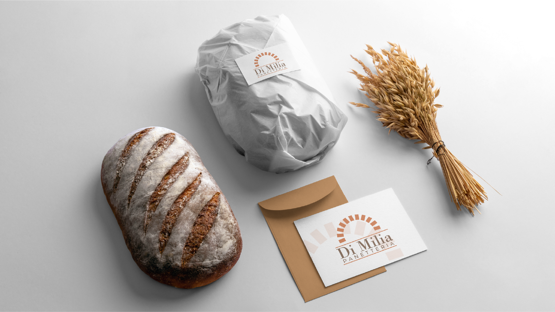
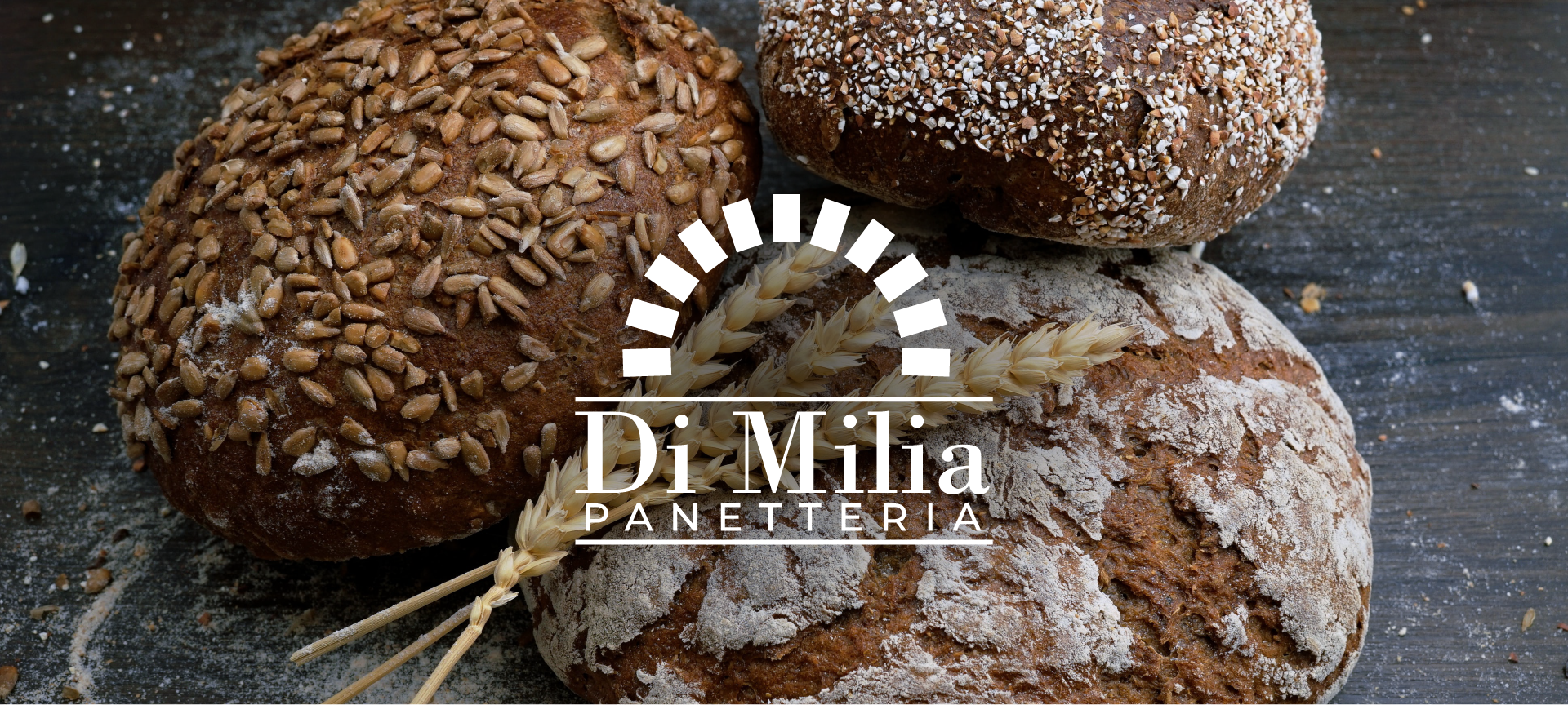
Crafting the Panetteria Di Milia Logo: Where Tradition Meets Elegance
I had the distinct pleasure of designing the logo for Panetteria Di Milia, a haven of timeless tradition and elegant simplicity, where the art of breadmaking takes center stage.
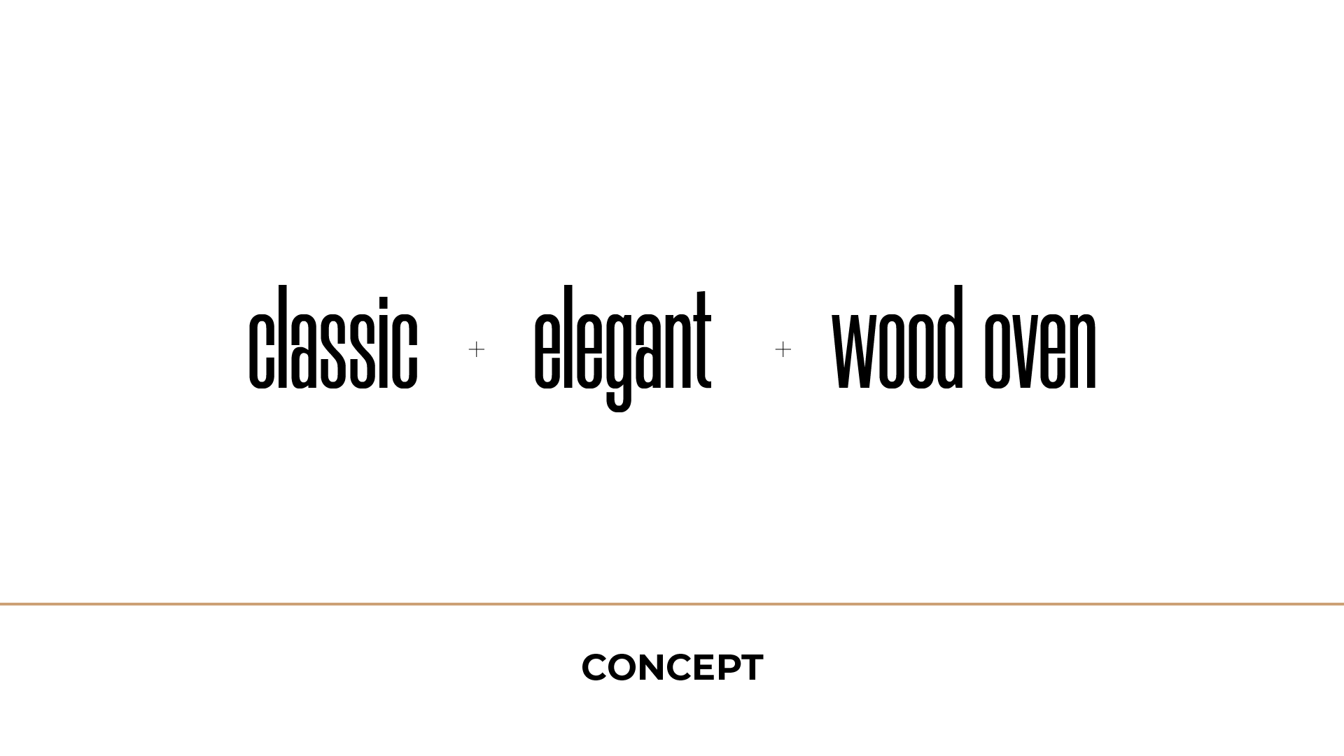
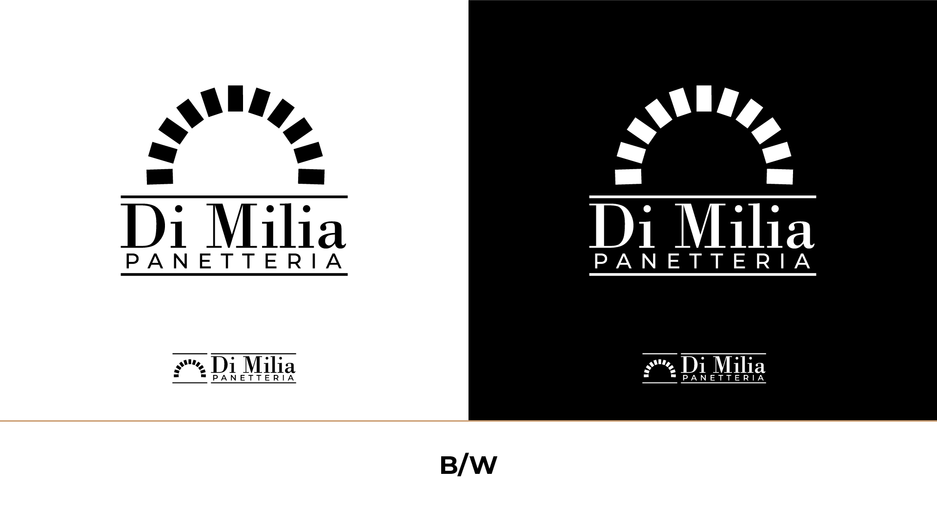
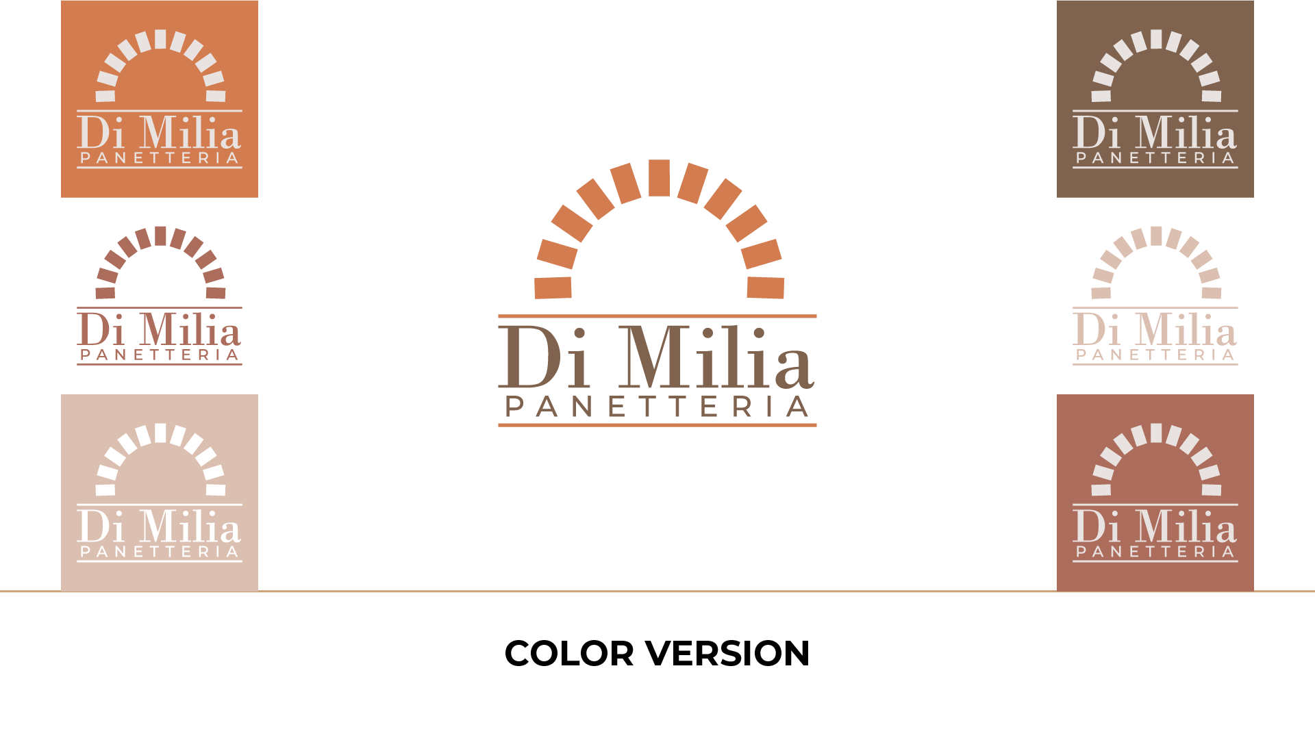
The concept behind this logo pays homage to the soul of Panetteria Di Milia—an artisanal wood oven, meticulously constructed from bricks. This iconic wood oven, symbolic of warmth and craftsmanship, captures the essence of the bakery. It’s more than a logo; it’s a testament to a centuries-old tradition of artisanal baking.
It’s a visual feast, conveying the passion and dedication that go into every loaf of bread.
As you behold the Panetteria Di Milia logo, you embark on a journey back in time, where simplicity and quality are the core ingredients. The logo speaks to the heart of the bakery’s ethos, where every bite of bread carries a legacy of flavor.
Anyone can design a logo. But not everyone can design the right logo.
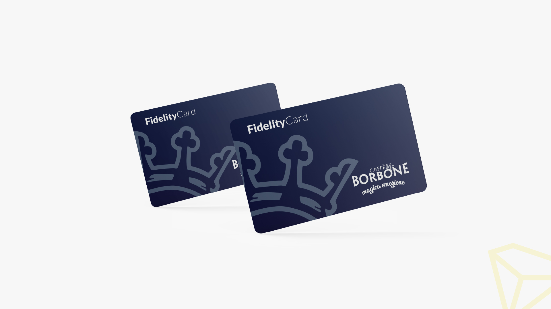
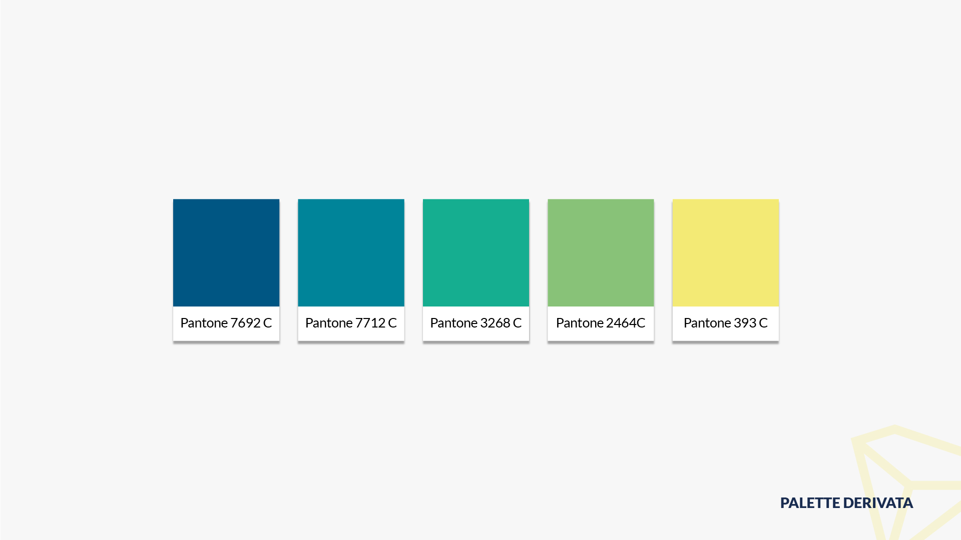
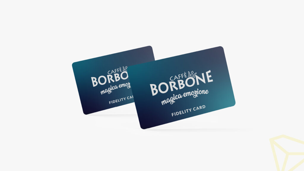
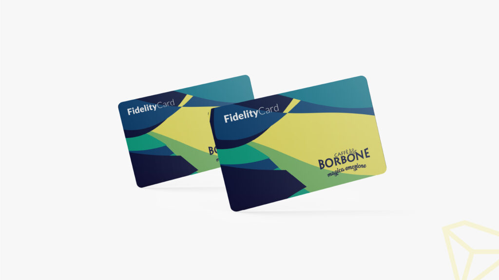
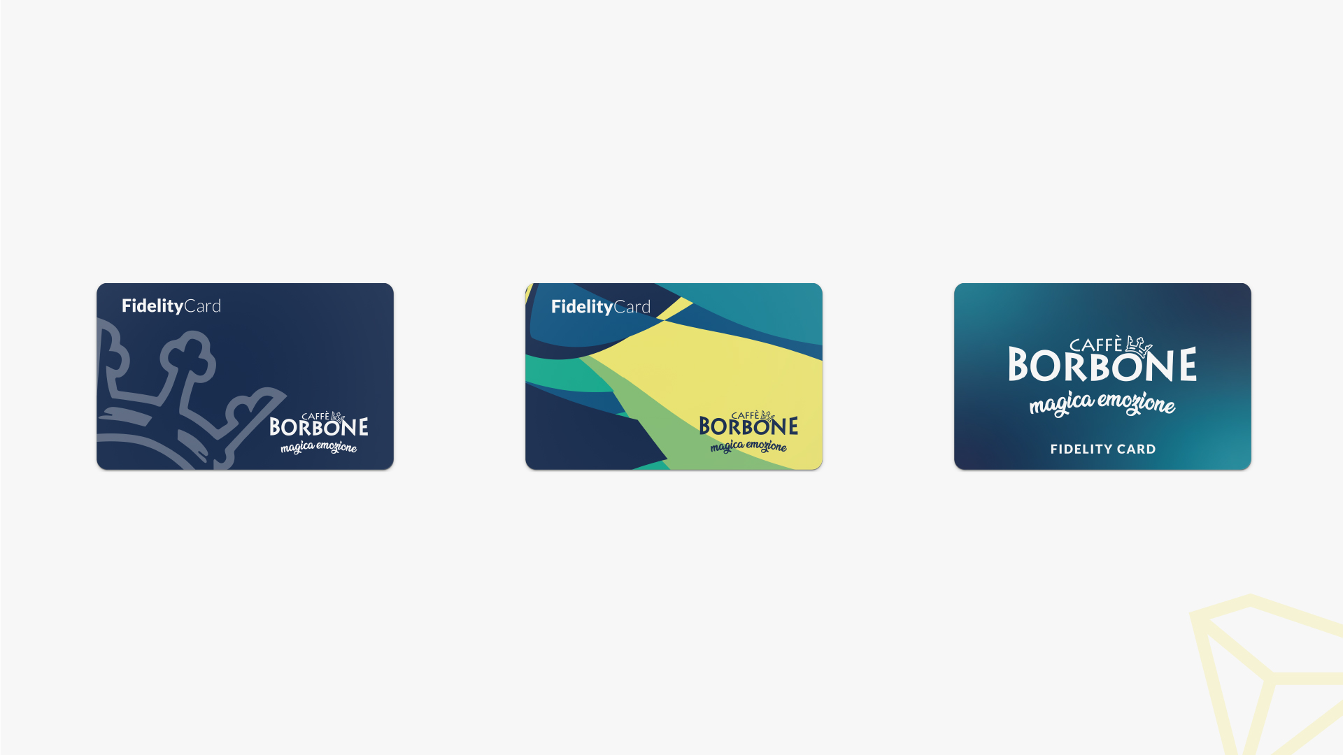
In the realm of creativity and design, I had the unique opportunity to lend my artistic touch to the world of Caffè Borbone. During my tenure at Diamante Content, I was entrusted with the task of conceiving a fidelity card that would become a cherished piece for coffee aficionados.
This wasn’t just about designing a card; it was about crafting an artistic masterpiece. Each fidelity card embodies the very essence of Caffè Borbone’s dedication to quality and excellence. With every stroke and every element, I aimed to create a visual symphony that resonates with the brand’s rich heritage.
Today, these fidelity cards have found their place in the hands of coffee lovers throughout Italy. They’re more than just cards; they’re tokens of appreciation, artful reminders of the extraordinary coffee experiences that await at Caffè Borbone.
The fidelity card design isn’t just a piece of plastic; it’s a work of art, a testament to the fusion of creativity and brand devotion. It’s a visual narrative that invites patrons to embark on a journey of taste and aroma, a journey that begins with a simple card.
Some people think design means how it looks. But of course, if you dig deeper, it’s really how it works.
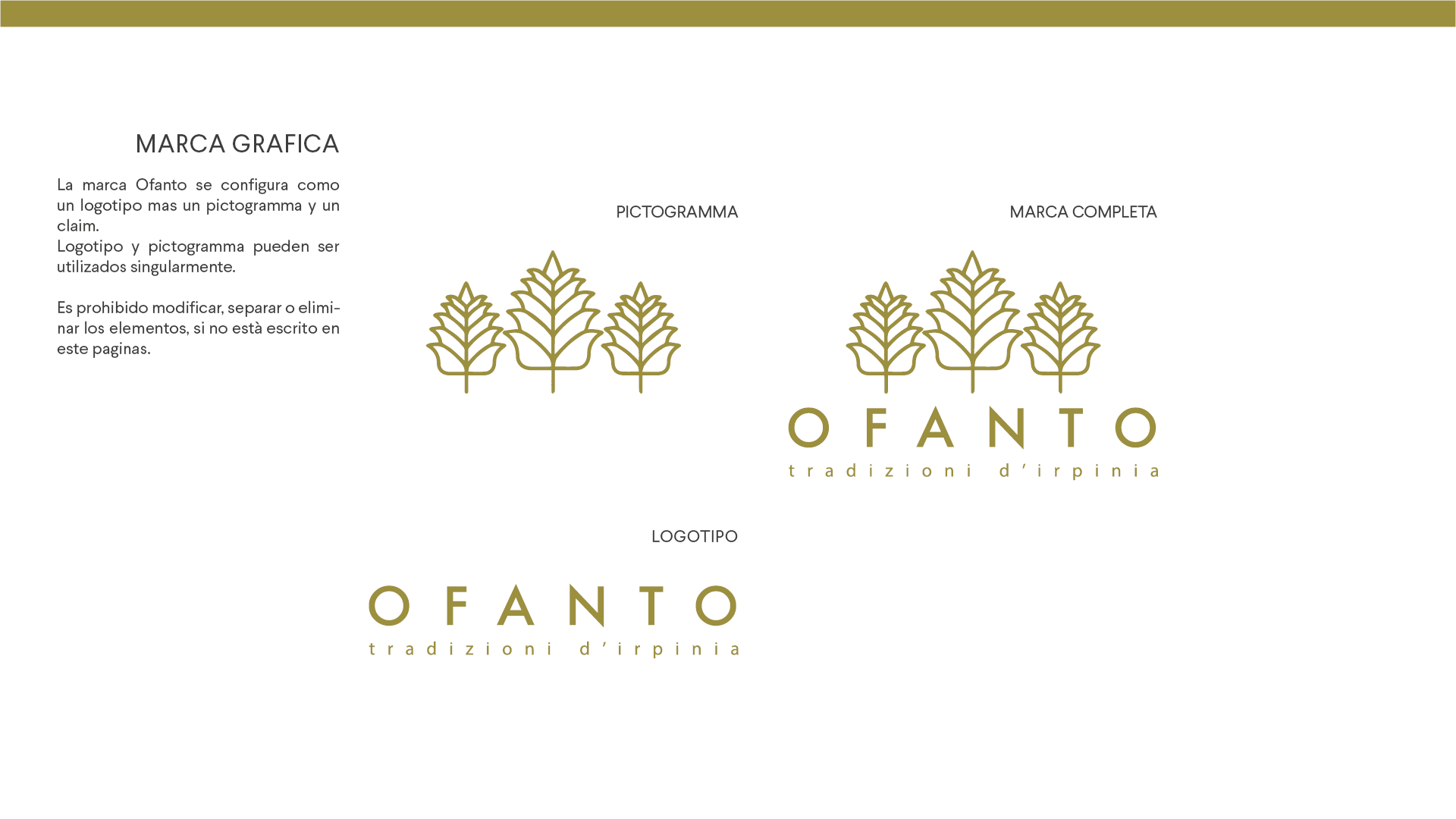
This brand was born in the south of Italy and its aim is, starting from the bottom, to make the products of this land known all over Italy and, hopefully, all over the world. In order to reach this goal, Ofanto’s products will be different from the competitors in the bakery market thanks to the traditional ingredients such as the “Senatore Cappelli” wheat, an old wheat that has nutritional properties that no other wheat in the world has.
Thanks to this quality and traditional recipes the products will be better than the competitors. This, combined with an aggressive national marketing can bring the company in the heart of the Italian consumers. The name, “Ofanto”, is the same as the name of a river, which is unknown to the masses but is the largest river in southern Italy. The ears of wheat indicate the type of product that the company produces and are three as a perfect number, like the perfection that Ofanto wants to reach.
Anyone can design a logo. But not everyone can design the right logo.
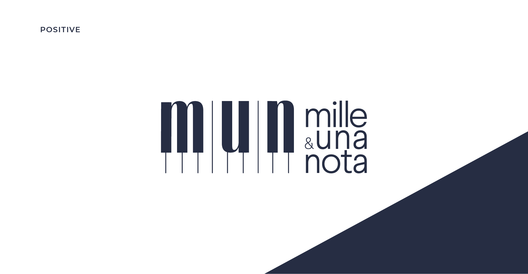
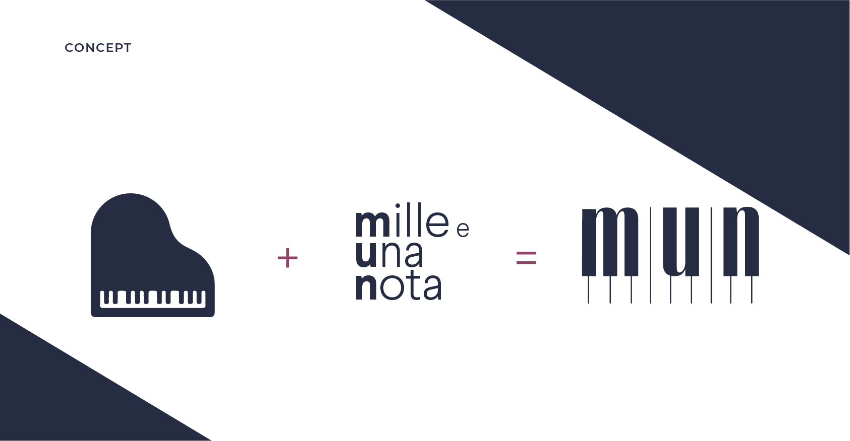
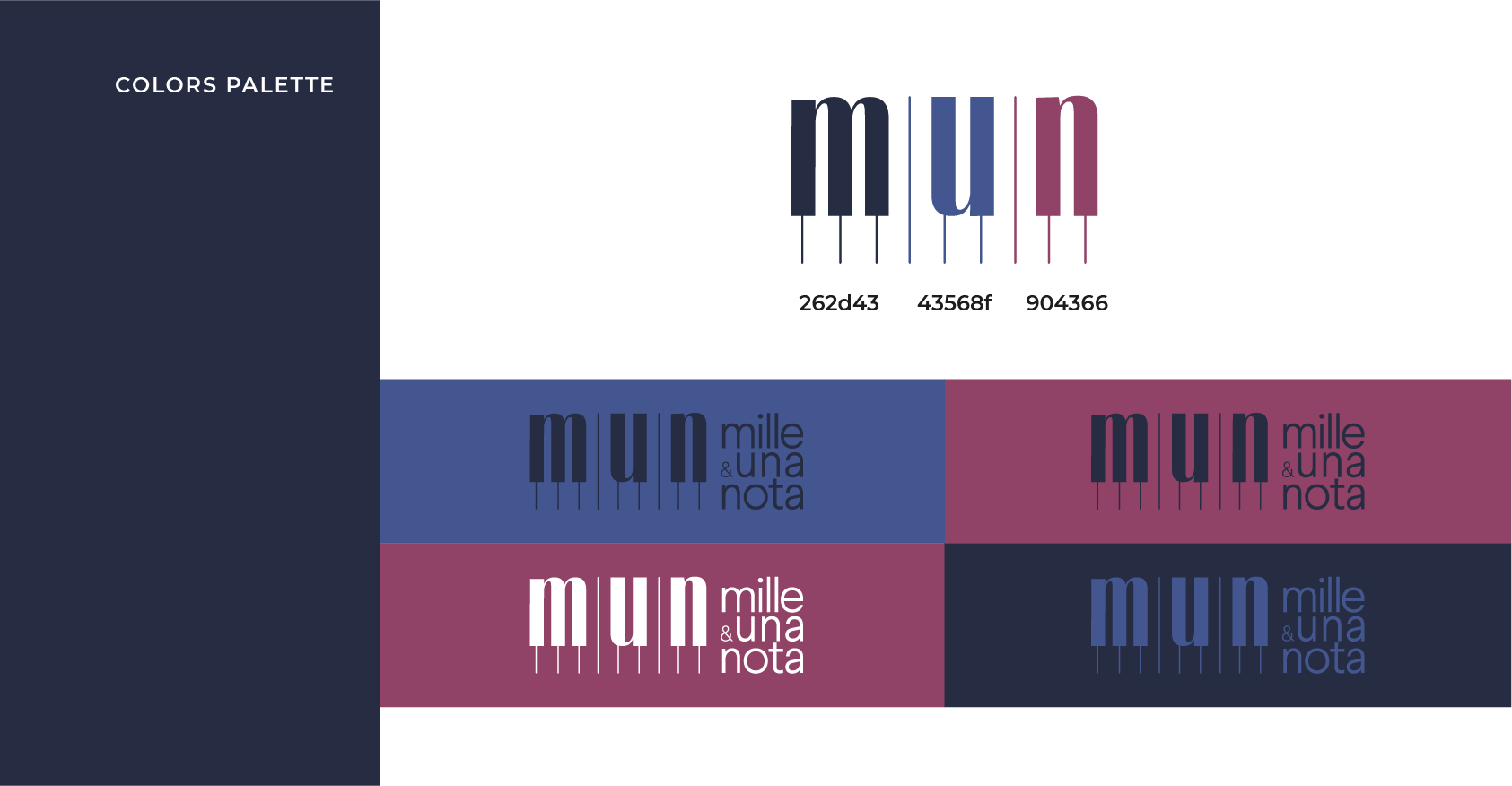
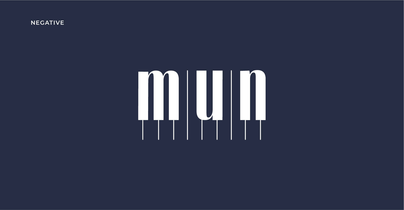
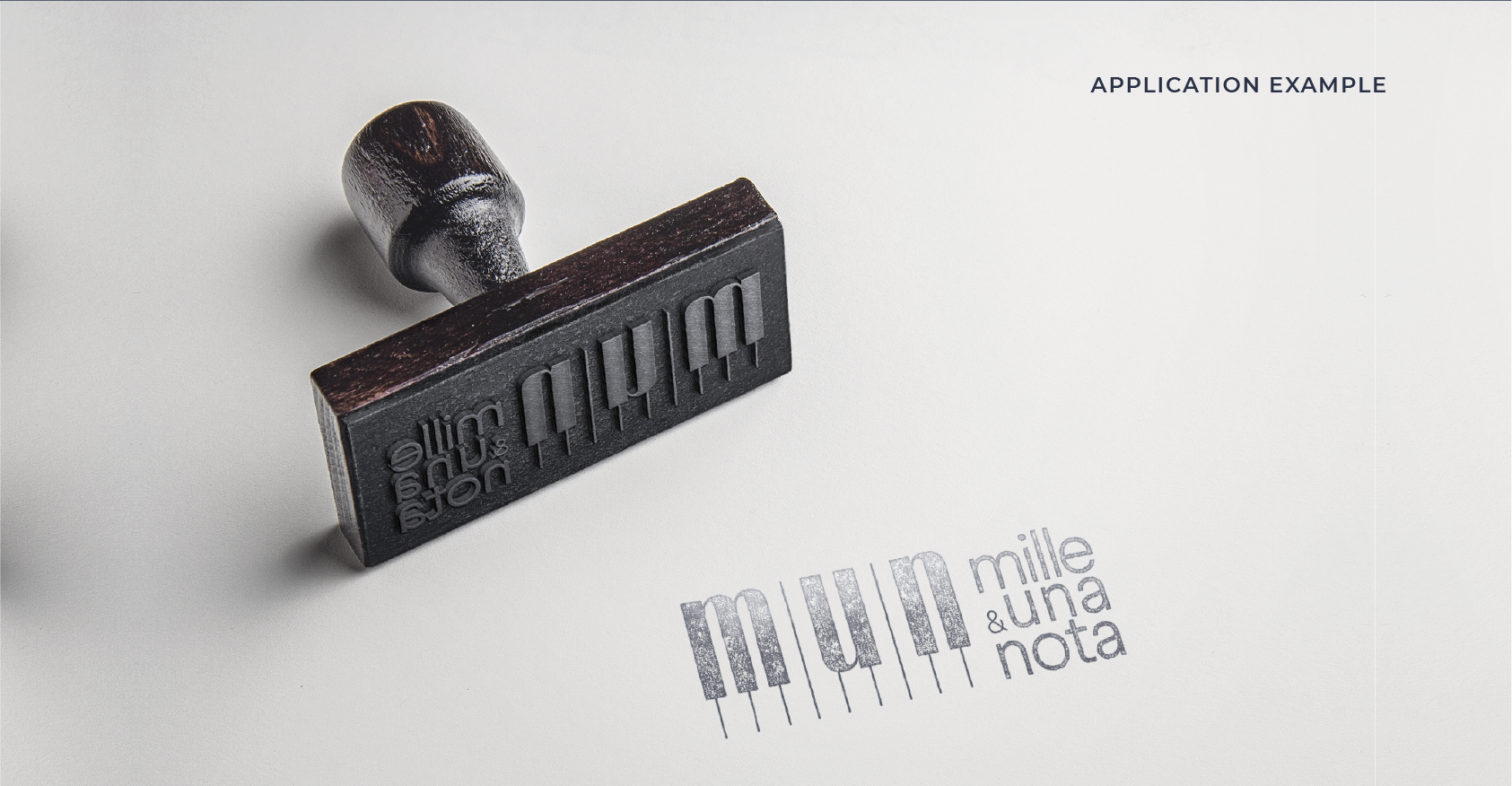
I had the pleasure of crafting a logo for Mille e una Nota, a musical association dedicated to helping people discover the joy of playing musical instruments. At the heart of our work is the “Concorso Internazionale di Musica Città di Airola,” an international music competition that draws talented musicians from across the globe.
The logo I designed is more than just an image; it’s a visual symphony. Inspired by the concept of the piano, a metaphor for the word “Nota” within the association’s name, I embarked on a journey to create a logo that captures the essence of music. This logo showcases a minimalist piano design, cleverly incorporating the first three initials of the association’s name.
Just as Mille e una Nota aims to inspire a world of musical passion, the logo serves as a harmonious introduction to the rich and diverse world of sound. It’s not just a logo; it’s a tune that resonates with the association’s mission.
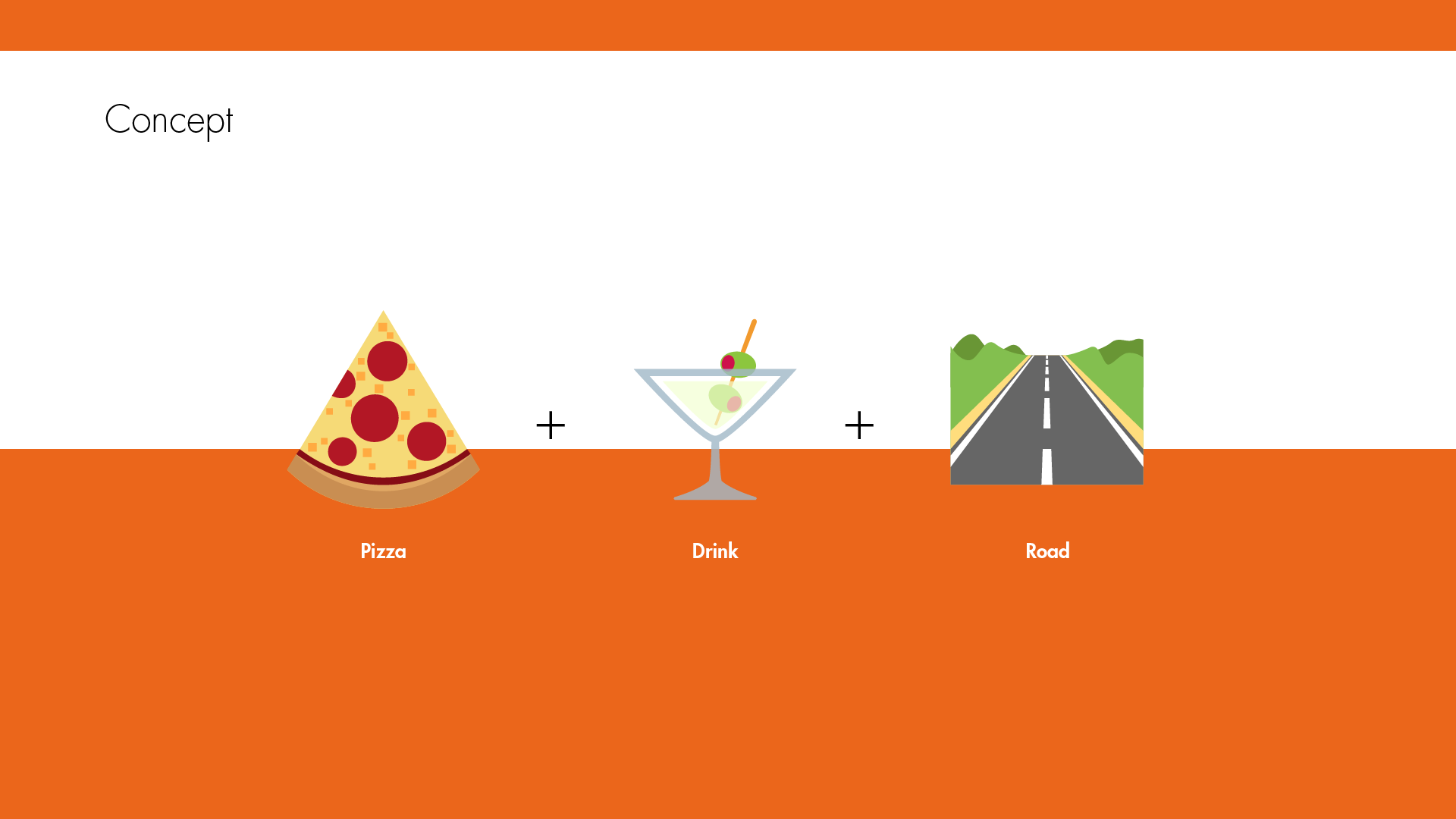
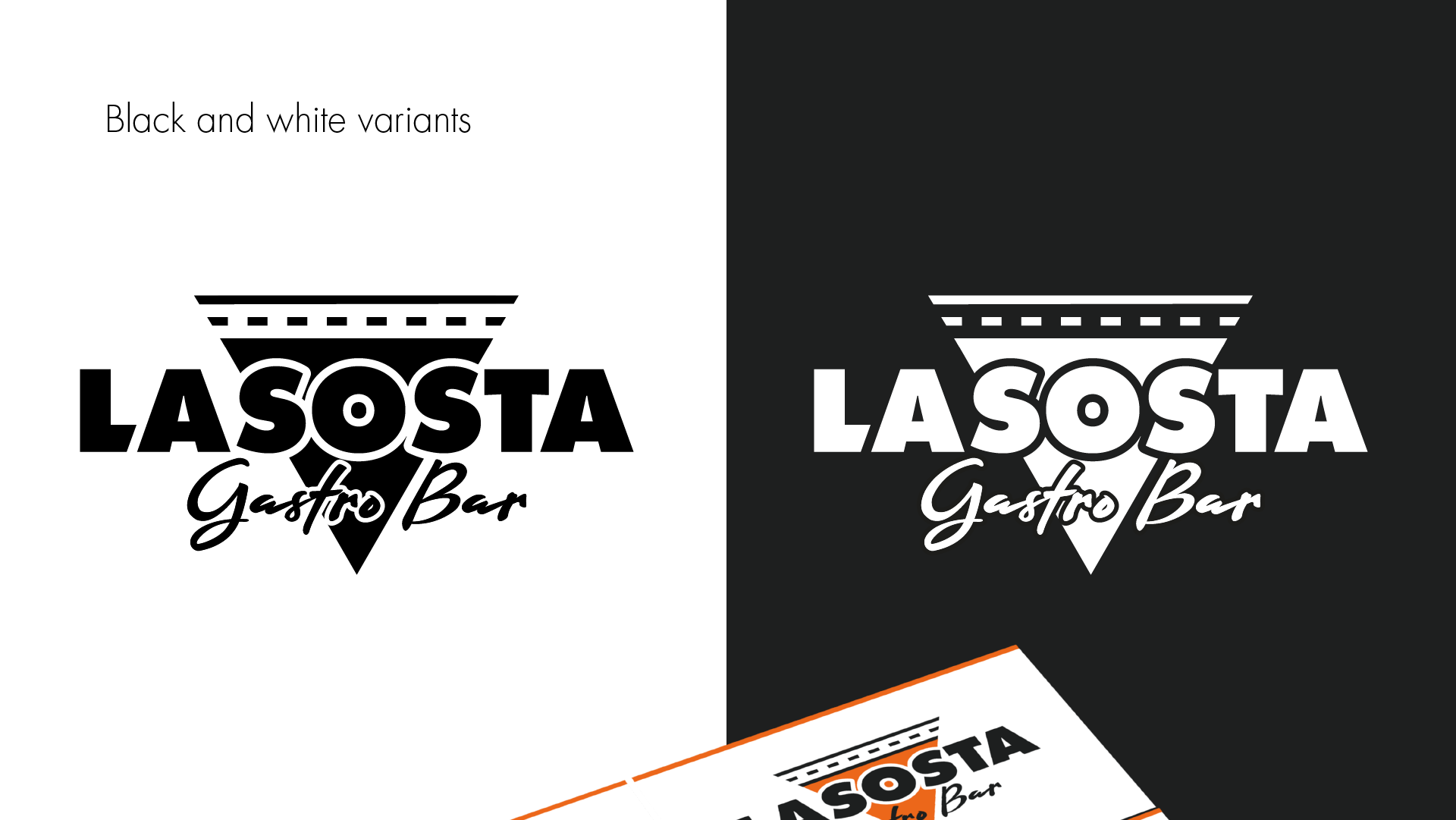
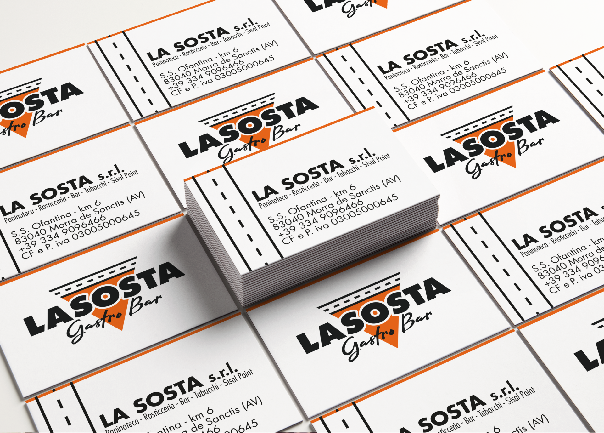
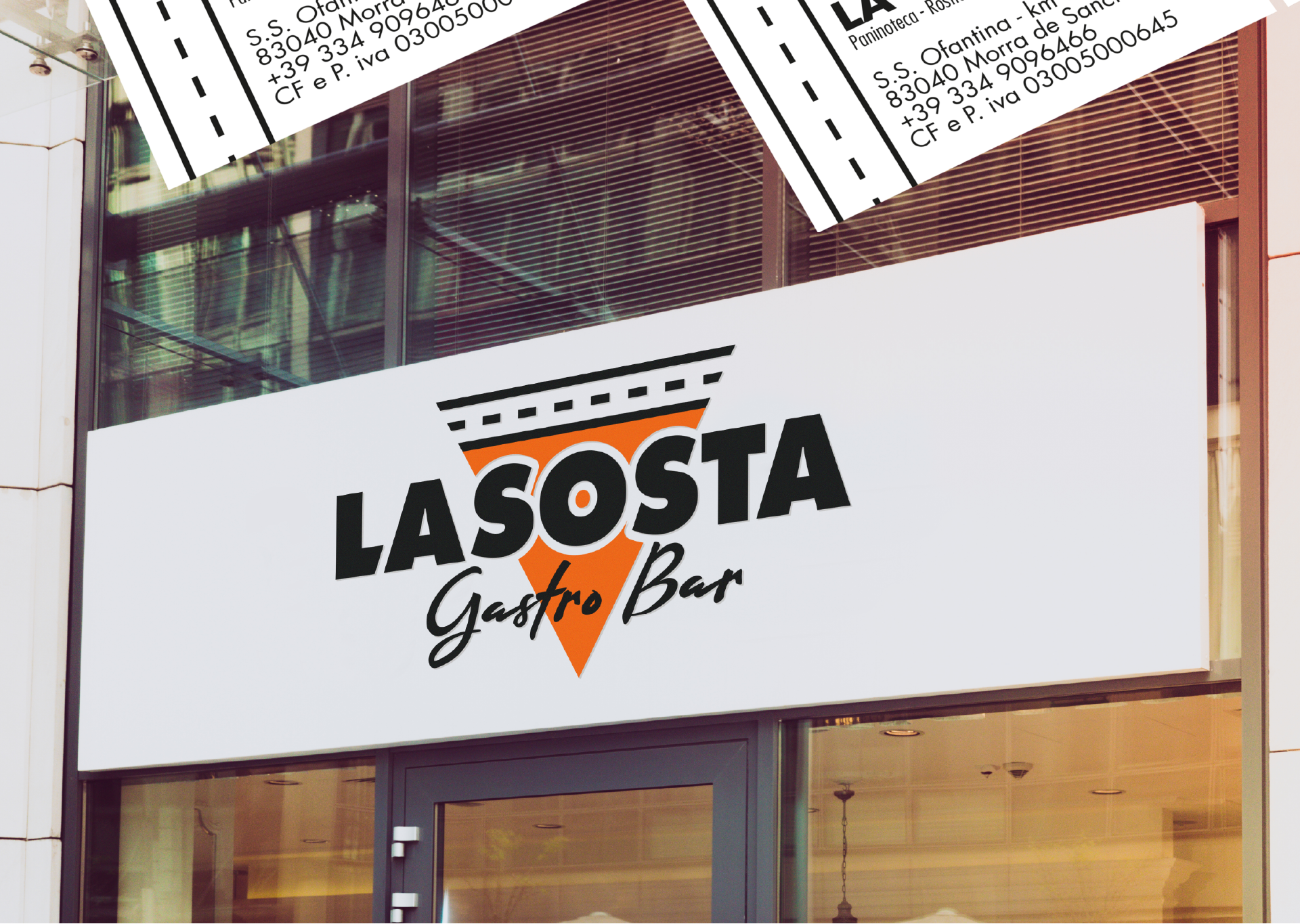
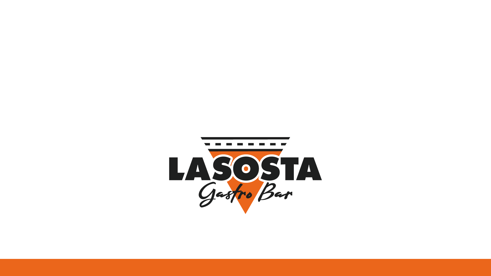
Allow me to introduce the logo designed for “La Sosta – Gastro Bar,” a hidden gem nestled along the picturesque “Ofantina” road, near the charming town of Morra de Sanctis. This emblem encapsulates the essence of this gastro bar, merging a sense of place with the promise of delectable food and drink.
At the core of the logo is the quest to convey not just the name but also the very spirit of “La Sosta.” The vibrant orange silhouette, crowned by a stylized road, effortlessly guides you to its doorstep, much like a welcoming beacon to travelers. It’s a visual ode to the convenience of the parking spot nestled near the establishment.
However, this logo goes beyond mere location; it tells a rich story of what “La Sosta” stands for. The iconic shape, resembling a triangular slice of pizza, embodies the fusion of culinary delights offered here. It’s a visual symphony that promises a delicious blend of flavors, where food and drink come together in perfect harmony.
As you gaze upon the La Sosta – Gastro Bar logo, you embark on a journey of discovery, where the essence of location meets the magic of gastronomy. It’s more than just an emblem; it’s an invitation to savor the distinctive tastes and flavors that await within.
Anyone can design a logo. But not everyone can design the right logo.
We use cookies to ensure that we give you the best experience on our website. If you continue to use this site we will assume that you are happy with it.